Transforming elderly living spaces starts with stunning color combinations that enhance comfort and well-being. Try calming blues and soft whites for serenity, or energizing yellows and warm grays to uplift social areas. Revitalizing greens paired with natural wood tones evoke a connection to nature, while cozy persimmons and creamy neutrals brighten the mood. Consider tranquil lavenders, cheerful corals, classic navy, and bold reds to create inviting environments. Explore even more fantastic combinations to elevate your space and improve your loved one's quality of life.
Key Takeaways
- Calming blues and soft whites create a serene atmosphere, enhancing brightness and reducing anxiety for elderly residents.
- Energizing yellows and warm grays brighten common areas, promoting social interaction while providing a cozy touch.
- Refreshing greens and natural wood tones foster a calming environment while improving indoor air quality and connecting residents to nature.
- Cheerful coral and cool teals balance happiness and tranquility, enhancing mood and aiding navigation for seniors.
- Classic navy and crisp whites offer a sophisticated look that promotes relaxation, while enhancing spatial awareness and natural light.
Calming Blues and Soft Whites
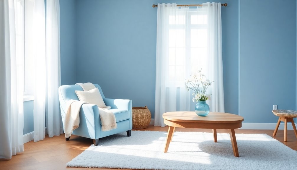
When you choose calming blues and soft whites for elderly living spaces, you create an inviting environment that promotes relaxation.
Calming blues, like soft sky blue and breezy shades, establish a serene atmosphere that helps reduce anxiety. Pairing these hues with soft whites enhances brightness, making rooms feel more spacious and open.
This combination also aids visual clarity, providing better contrast against furnishings, which is essential for seniors with vision challenges. Soft whites serve as a versatile backdrop, complementing various design elements while reflecting natural light to uplift mood.
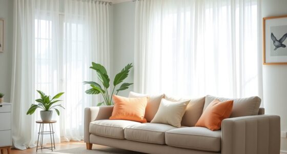
Incorporating textiles in calming blues and soft whites, such as throws and curtains, adds layers of warmth, further contributing to a cozy and comforting living space.
Energizing Yellows and Warm Grays
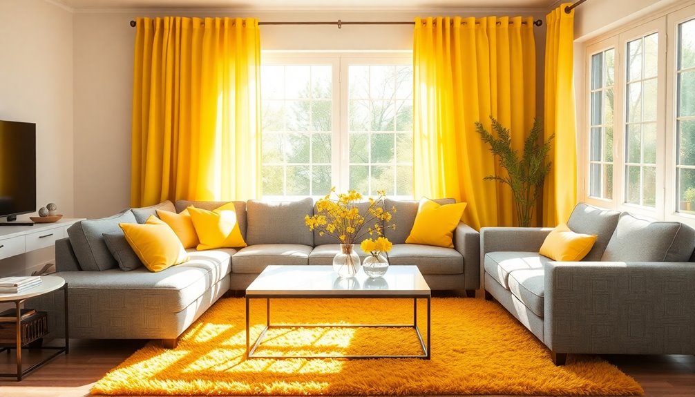
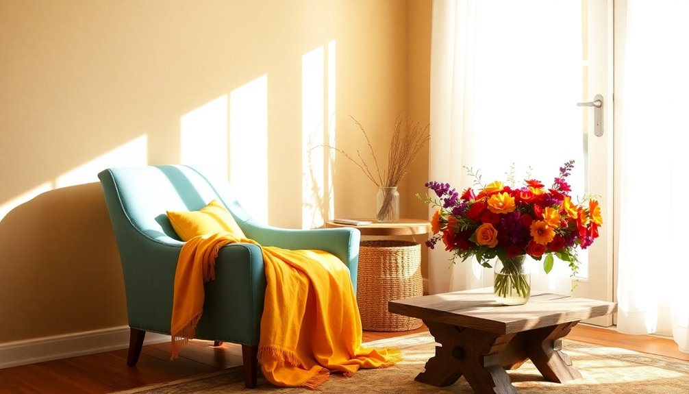
Energizing yellows can brighten common areas, creating a cheerful atmosphere that encourages social interaction.
Pairing these vibrant hues with warm grays adds a cozy touch, making spaces feel both inviting and sophisticated.
This combination not only enhances the aesthetic but also supports emotional well-being for elderly residents.
Brightening Common Areas
Brightening common areas can transform a living space into a welcoming hub for residents. By incorporating energizing yellows, like Limitless, you create an uplifting atmosphere that encourages social interaction and happiness in your senior living community.
Pair these vibrant yellows with warm grays, such as Cracked Pepper, to establish a sophisticated backdrop that enhances brightness without overwhelming the senses. This combination not only offers visual contrast, helping furniture and decor stand out, but also aids seniors with vision challenges.
Additionally, the warmth of these colors fosters comfort, encouraging engagement among residents. Utilizing these shades in common areas can also assist in wayfinding, clearly delineating different zones and functions within the space. Moreover, incorporating heat pumps into the design can enhance indoor air quality, creating a healthier environment for all.
Creating Cozy Ambiance
Creating a cozy ambiance in elderly living spaces is essential for fostering comfort and connection. Energizing yellows paired with warm grays create a cheerful yet soothing environment, uplifting moods and promoting relaxation.
This combination not only enhances spatial clarity but also provides a familiar and inviting atmosphere for individuals with memory issues.
- Bright yellows evoke happiness and stimulate social interaction.
- Warm grays offer a calming balance, reducing anxiety.
- Together, they create visual harmony that feels safe and nurturing.
In addition, this color scheme can significantly reduce stress levels, promoting a sense of calm for the residents.
Refreshing Greens and Natural Wood Tones

When you incorporate invigorating greens and natural wood tones into elderly living spaces, you'll instantly foster a calming atmosphere that promotes relaxation.
Rejuvenating greens, like soft sage or vibrant emerald, create a serene backdrop that enhances emotional well-being. Pair these hues with natural wood tones, such as oak or walnut, to add warmth and a comforting contrast.
This combination not only evokes feelings of connection to nature but also improves indoor air quality when you include air-purifying plants like snake plants or peace lilies. Additionally, the use of natural materials in decor can further enhance the overall aesthetic and comfort of the space.
The interplay of green and wood not only brings in natural light but also aids in wayfinding and spatial awareness, making it easier for seniors to navigate their environment with confidence.
Cozy Persimmons and Creamy Neutrals
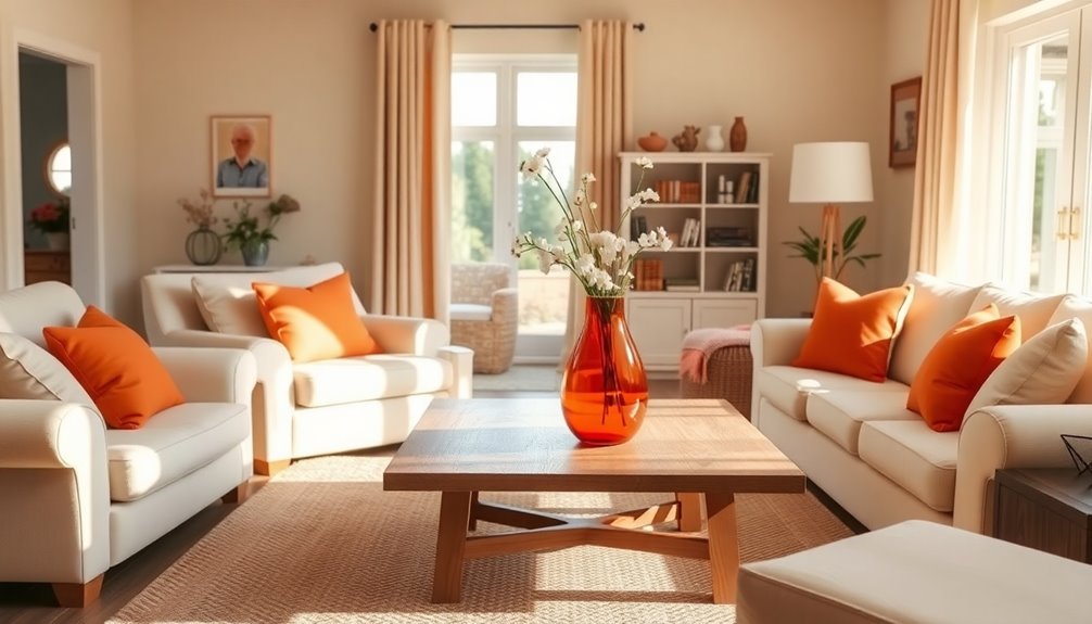
Incorporating cozy persimmons with creamy neutrals transforms living spaces into warm, inviting environments perfect for social interaction.
This vibrant color combination fosters a lively yet calming atmosphere essential for emotional well-being. You'll find that the soft backdrop of creamy neutrals enhances the energetic persimmons, creating a balanced space.
- It brightens the mood, encouraging conversations and connections.
- Cozy persimmons bring a touch of joy, while creamy neutrals provide comfort.
- This palette enhances visibility, supporting seniors with vision challenges.
Utilizing cozy persimmons through accessories like throw pillows or artwork allows for easy updates to the decor, keeping the environment fresh and engaging.
Additionally, creating a digital-friendly environment with these colors can inspire creativity and interaction among seniors and their loved ones.
Together, these colors create a safe and welcoming haven for everyone.
Tranquil Lavenders and Light Beiges

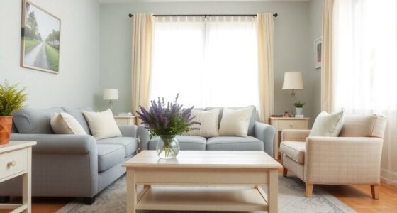
By blending tranquil lavenders with light beiges, you can cultivate a serene living space that promotes relaxation and comfort. Tranquil lavenders create a calming atmosphere, ideal for reducing anxiety in elderly living spaces.
Meanwhile, light beiges serve as a warm neutral backdrop, enhancing brightness and offering a versatile canvas for your decor. This harmonious color combination provides visual interest without overwhelming the senses, making it easier for seniors to navigate their environment.
You can incorporate these colors through textiles like curtains and throw pillows, adding comfort and softness. Additionally, the contrast between lavender and light beige can assist seniors with visual impairments, improving their spatial awareness and helping them feel more at ease in their surroundings. Consider employing lighting design techniques to further enhance the mood and functionality of the space.
Dramatic Charcoal and Bright Accents
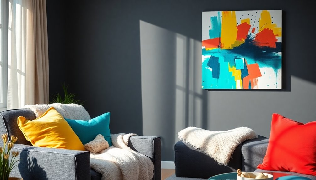
Using a deep charcoal like "Cracked Pepper" can really enhance the contrast and depth of your living space.
When you add vibrant accents, such as lively yellows or reds, you'll create warmth that uplifts the entire room.
This combination not only looks striking but also helps seniors navigate their environment with ease.
Enhancing Contrast and Depth
While a dramatic charcoal backdrop like "Cracked Pepper" sets a sophisticated tone, adding bright accents can transform your living space into a vibrant and inviting environment.
This color scheme not only enhances aesthetic appeal but also provides essential contrast and depth. By incorporating lively yellows or blues, you energize the room and create visual accessibility for seniors, aiding wayfinding and reducing fall risks. Moreover, choosing trending color schemes for aging can significantly improve the overall atmosphere of a living space, fostering a sense of comfort and security. Soft, harmonious tones combined with bright accents not only elevate the design but also help in creating familiar and comforting environments. This thoughtful approach to color can empower seniors to navigate their surroundings with greater confidence and ease.
- Bright cushions invite comfort and warmth.
- Striking artwork draws attention to key areas.
- Accent lighting highlights your unique style.
These elements work together, making your space more engaging and personalized. Additionally, incorporating eco-friendly paints ensures a healthier living environment for seniors.
Embrace the balance of dramatic charcoal and bright accents to reflect your individuality while ensuring a safe, inviting atmosphere.
Vibrant Accents for Warmth
Vibrant accents bring warmth and energy to living spaces adorned with dramatic charcoal hues like "Cracked Pepper." This striking combination not only adds visual interest but also creates a welcoming atmosphere that feels both sophisticated and cozy.
You can make your space truly inviting by incorporating bright accents such as sunny yellows or vibrant oranges. These colors energize the room, making it feel cheerful against the deep backdrop.
Adding cushions, artwork, or decorative objects in these hues enhances spatial awareness, minimizing fall risks for seniors. This color scheme also encourages personalization, allowing residents to express their style while ensuring a cozy, safe environment. Additionally, color accuracy plays a crucial role in enhancing the overall visual appeal of your living space, making the vibrant accents pop even more.
Embrace vibrant accents to uplift the mood and create connections in your living space!
Breezy Sky Blues and Earthy Browns

Breezy sky blues and earthy browns create a soothing and inviting atmosphere that's perfect for elderly living spaces. This calming color palette not only promotes relaxation but also instills a sense of safety.
Here's why you'll love this combination:
- Tranquility: Breezy sky blues evoke peace, making the environment serene.
- Warmth: Earthy browns provide stability and comfort, reducing anxiety.
- Contrast: The mix enhances room navigation, clearly defining areas for different activities.
Additionally, incorporating digital literacy programs can further enhance communication and connectivity among seniors in their living spaces.
Cheerful Coral and Cool Teals
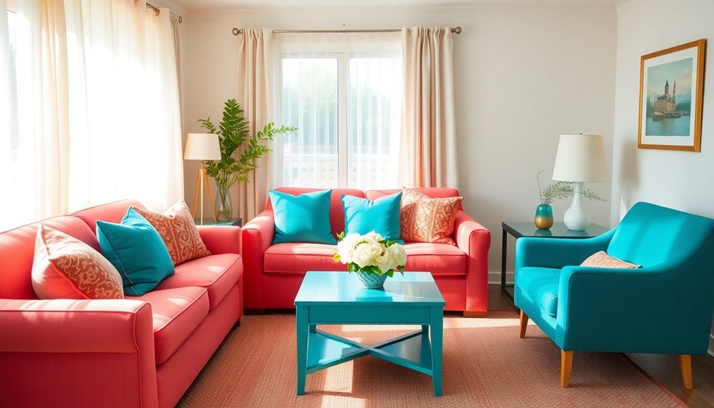
When you introduce cheerful coral and cool teals into elderly living spaces, you create an atmosphere that's both energizing and calming. This vibrant coral color promotes happiness and interaction, perfect for communal areas. In contrast, cool teals soothe the environment, fostering a balanced and inviting space feel. Together, they enhance mood and well-being. Adding proper diet considerations for seniors can further improve their overall health and happiness.
| Color | Effect | Usage Ideas |
|---|---|---|
| Cheerful Coral | Promotes energy | Pillows, art, accessories |
| Cool Teals | Provides calmness | Walls, furnishings |
| Combination | Visually appealing | Enhances overall aesthetics |
Incorporating these colors not only beautifies the area but also improves visibility for seniors, making navigation easier.
Classic Navy and Crisp Whites

After exploring the uplifting hues of cheerful coral and cool teals, consider the refined combination of classic navy and crisp whites.
This timeless palette creates a sophisticated look that promotes tranquility and elegance in elderly living spaces. Navy's deep tone evokes feelings of stability and serenity, making it perfect for bedrooms and living areas.
Meanwhile, crisp whites enhance natural light, making your spaces feel open and airy.
- Promotes relaxation and calmness
- Enhances mood and visibility
- Aids in spatial awareness and navigation
Personalize this combination with decorative accents like throw pillows and artwork, allowing you to express your individual style while maintaining a cohesive look.
Together, navy and white can truly transform your living environment.
Bold Reds and Muted Creams

Bold reds and muted creams create a dynamic yet soothing environment, ideal for elderly living spaces. The vibrant reds evoke energy and passion, perfect for social areas, while muted creams provide a calming backdrop that promotes relaxation.
This contrast not only enhances visibility for those with vision impairments but also helps clearly define spaces and furniture. You can add color by using bold reds as accents—think throw pillows or artwork—against cream walls.
This combination stimulates positive emotions and fosters lively interactions in communal areas. By reflecting natural light, muted creams make your living space feel larger and brighter.
Strategically placing bold reds draws attention to specific areas, creating a warm, inviting atmosphere without overwhelming the senses. Incorporating neutral color palettes can further enhance the calming effect of the space.
Frequently Asked Questions
What Color Can Elderly See Best?
When considering what colors elderly individuals see best, you're looking at softer hues like blues and greens, which are easier on the eyes.
High-contrast combinations, such as dark furniture against light walls, enhance visibility and help with spatial awareness.
Solid colors work better than busy patterns, which can cause confusion.
Colors like yellow and orange are great for stimulating attention, while pale blue and light green promote calmness and relaxation.
What Colors Are Most Desirable in the Décor of a Nursing Home or Senior Living Setting?
When choosing colors for a nursing home or senior living setting, you'll want to focus on warm hues like persimmon and limitless yellow to create an inviting atmosphere.
Soft blues like renew blue and upward can promote relaxation. High-contrast color schemes improve visibility, aiding navigation.
Adding dramatic hues like cracked pepper adds sophistication. To help residents with vision impairments, opt for solid colors in furniture and décor while minimizing busy patterns for better accessibility.
What Is the Color Palette for Seniors?
You might find it surprising that the right colors can transform your space into a sanctuary.
For seniors, a color palette should focus on soft, muted tones like blues and greens to create a calming atmosphere. High-contrast combos help with visibility, while warm yellows and oranges can uplift communal areas.
Neutral tones provide a sophisticated backdrop, allowing personal accents to shine without overwhelming the senses.
Thoughtful color choices make a significant difference in well-being!
What Is the Best Color for an Elderly Bedroom?
When choosing the best color for an elderly bedroom, consider calming shades like pale yellow, soft blue, or gentle brown.
These colors promote relaxation and tranquility, which are essential for restful sleep. You can also use contrasting bedding to help define the sleeping area, making it easier to identify the bed.
Incorporating personal items will enhance the sense of ownership, creating a comforting atmosphere that helps your loved one feel at home.
Conclusion
By choosing the right color combinations, you can transform elderly living spaces into vibrant, uplifting environments. Just like a well-tended garden, these colors can rejuvenate the atmosphere, making it feel fresh and inviting. Whether you opt for calming blues or energizing yellows, each palette has the power to enhance comfort and joy. So, embrace these stunning combinations and create a sanctuary that reflects warmth, harmony, and liveliness for your loved ones.
