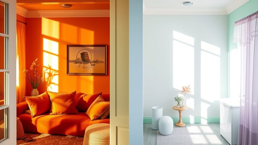
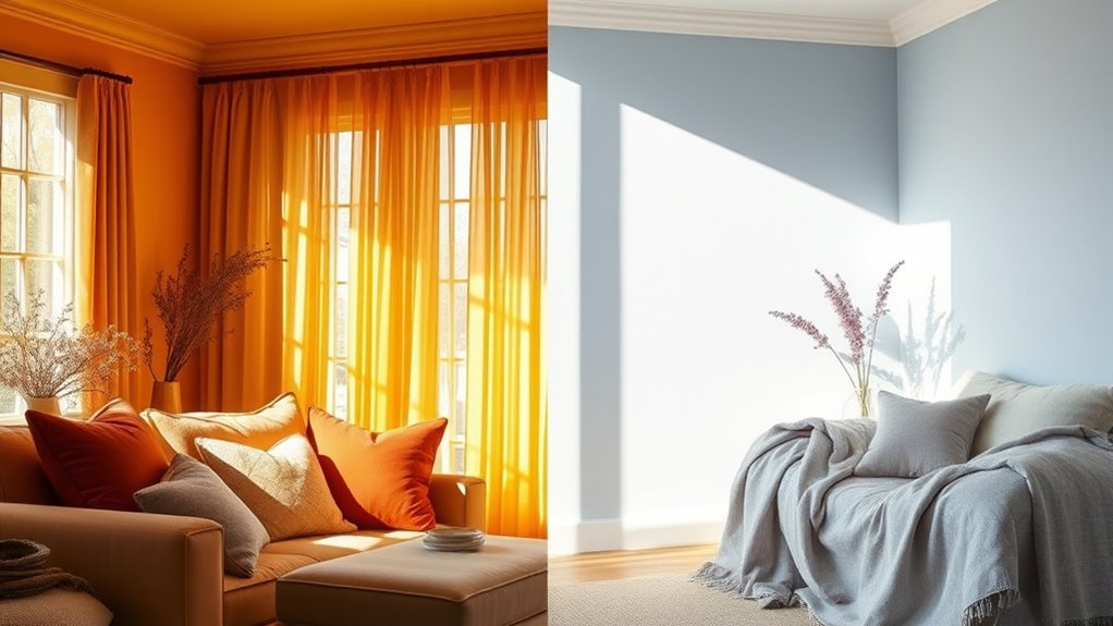
When choosing between warm and cool color schemes to create comfort, consider the mood you want to evoke. Warm tones like reds, oranges, and yellows energize and invite social interactions, making spaces feel lively and welcoming. Cool shades like blues, greens, and purples promote calmness and relaxation, ideal for restful environments. Understanding how these colors influence emotions and cultural meanings helps you craft spaces that truly feel comforting—if you want to explore more, keep going.
Key Takeaways
- Warm colors evoke energy and intimacy, making spaces feel inviting and lively, ideal for social or personal environments.
- Cool colors promote calmness and relaxation, suitable for tranquil or focus-oriented spaces.
- Consider cultural associations; for example, red signifies luck in some cultures but danger in others.
- Balance emotional impact and cultural meanings to select the most comforting color scheme for your audience.
- Use warm tones to energize or foster intimacy, and cool tones to create serenity and focus within your design.

Color schemes are the foundation of effective design, influencing how viewers perceive and feel about a space or project. When you choose warm or cool colors, you’re not just selecting aesthetics—you’re shaping emotional impact and tapping into cultural associations that can evoke specific feelings or meanings. Warm colors like reds, oranges, and yellows tend to create a sense of energy, comfort, and intimacy. They can make a space feel inviting and lively, encouraging social interaction and warmth. Conversely, cool colors such as blues, greens, and purples often promote calmness, relaxation, and serenity. These shades are ideal when you want to foster a tranquil environment or a professional atmosphere. Recognizing how these color choices affect emotional responses is key to designing spaces that resonate with their intended purpose. Additionally, understanding the color meanings and associations of aura colors can help inform how certain hues might influence emotional states and perceptions. Your cultural associations with colors further influence how your audience interprets your design. For example, in Western cultures, red often symbolizes passion or danger, while in some Asian cultures, it signifies luck and celebration. Green might evoke health and growth in many contexts but can also be associated with envy or greed. Blue is frequently linked to trust and stability, making it common in corporate branding, yet in some cultures, it can symbolize mourning. By understanding these cultural nuances, you can select color schemes that align with your audience’s expectations and avoid misinterpretations. This awareness allows you to craft environments that not only look appealing but also communicate the right message. When you’re choosing between warm and cool palettes, consider the emotional impact you want to produce. If your goal is to energize a space or create a sense of intimacy, warm tones are your best bet. For spaces meant to be calming or to promote focus, cool tones work well. Keep in mind that cultural associations can vary, so if your project targets a specific demographic or cultural context, tailor your color choices accordingly. This strategic approach ensures your design feels authentic and meaningful. Ultimately, selecting the right color scheme involves understanding both the emotional impact and cultural associations tied to each hue. You should think about how you want people to feel when they enter the space and what messages you want to convey. By balancing these elements, you can create environments that are not only visually appealing but also emotionally resonant and culturally appropriate. This thoughtful process helps you craft designs that comfort, inspire, and connect with your audience on a deeper level.

Bilingual Cool Winter Palette Color Fan, Personalized Color Guide for Smart Shopping, Outfit & Wardrobe Planning; Inverno Frio/Invierno Frio
FOUND YOUR COLOR IDENTITY — NOW WHAT? This fan takes the guesswork out of the next step after…
As an affiliate, we earn on qualifying purchases.
As an affiliate, we earn on qualifying purchases.
Frequently Asked Questions
How Do Cultural Differences Influence Color Preferences?
Cultural differences greatly shape your color preferences through cultural symbolism and regional preferences. You might find certain colors evoke specific emotions or meanings based on your background. For example, red can symbolize luck in China or mourning in South Africa. These cultural influences guide your choices, making some colors feel more comforting or appropriate in different contexts. Understanding these cultural nuances helps you select colors that resonate personally and culturally.
Can Color Schemes Affect Mood Over Long-Term Use?
Did you know that consistent color schemes can influence your emotional responses over time? When you maintain a steady palette, it helps create a sense of stability and comfort, positively affecting your mood long-term. Conversely, frequent changes might cause confusion or anxiety. So, choosing a cohesive color scheme can foster a calming environment, making your space more inviting and supportive of your emotional well-being over the long haul.
Are There Psychological Effects Associated With Warm and Cool Colors?
You might notice that warm colors like red and yellow evoke excitement and energy, while cool colors like blue and green promote calmness and relaxation. Color psychology shows these emotional responses are linked to long-term effects on mood. By understanding these psychological impacts, you can choose color schemes that foster positive feelings and comfort, helping you create spaces that naturally influence your emotional well-being over time.
How Do Lighting Conditions Impact Color Perception?
Lighting ambiance and color temperature profoundly impact how you perceive colors. Bright, cool lighting can make colors appear sharper and more vibrant, while warm, dim lighting softens tones, creating a cozy feel. When you adjust lighting conditions, you influence the mood and comfort of a space. So, consider your desired atmosphere and choose lighting that complements your color scheme for the most harmonious and inviting environment.
What Are the Best Color Schemes for Small Spaces?
In small spaces, you want to maximize light and create an open feel through smart color schemes. Opt for light, neutral shades to enhance space optimization and make the area appear larger. Use color coordination to keep the look cohesive and avoid cluttered sensations. Soft warm or cool tones can add warmth or calmness, depending on your preference, helping your small space feel more inviting and less cramped.

Glidden Total Interior Wall Paint & Primer All-in-One, Kingston Aqua/Aqua-Blue, Semi-Gloss, 1 Gallon
Extremely durable interior paint ideal for use on properly prepared interior walls, ceilings or trim composed of new…
As an affiliate, we earn on qualifying purchases.
As an affiliate, we earn on qualifying purchases.
Conclusion
Choosing between warm and cool color schemes is like selecting the perfect soundtrack for a scene—you want it to resonate and set the mood. Warm tones can wrap you in comfort, like a cozy blanket, while cool shades create calm and clarity. Trust your instincts and imagine how each palette makes you feel. Ultimately, your space should be a reflection of your inner harmony—like a melody that soothes your soul.

Hobby Lobby Metal Gecko Wall Art, Bouncing Head Design, Spring (Green)
VIBRANT DESIGN: Colorful metal gecko wall art featuring a blue head, orange-yellow body, and green feet with red…
As an affiliate, we earn on qualifying purchases.
As an affiliate, we earn on qualifying purchases.

Sunset LED Lamp Projector, 21 Colors Changing App & Remote Control Mood lighting, Music Sync Ambiance Lighting, Sunset Lamp for Bedroom, Living Room, Aesthetic Room Decor, Birthday Gifts for Women
【Keep the Sunset at Home】Beautiful sunsets are fleeting, and with this led lights, you don't have to travel…
As an affiliate, we earn on qualifying purchases.
As an affiliate, we earn on qualifying purchases.


