Adding a pop of color through well-chosen accents instantly elevates your decor from dull to dynamic. Use vibrant throw pillows, striking artwork, or colorful vases to create focal points within a serene monochromatic or neutral palette. These accents draw the eye and add personality without overwhelming the space. Strategic placement guarantees balance and harmony, making your room lively yet cohesive. Keep exploring to discover how to master these powerful design touches and truly make your decor shine.
Key Takeaways
- Use vibrant accent colors like orange or yellow against a neutral or monochromatic background for immediate visual impact.
- Incorporate small yet bold accessories, such as cushions or vases, to add pops of color without overwhelming the space.
- Balance bright accents with subdued shades to maintain harmony and prevent visual clutter.
- Strategically place contrasting accents to highlight focal points and create a dynamic, lively environment.
- Combine monochromatic schemes with vivid accents for a sophisticated, energetic, and cohesive decor look.
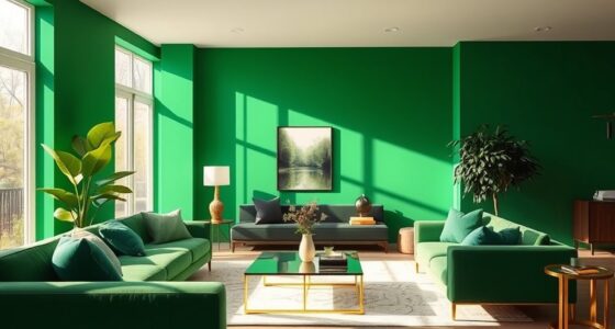
Color schemes are essential tools for creating visually appealing and cohesive designs. When you’re aiming to make your decor stand out, understanding how to use color effectively can transform a space from ordinary to extraordinary. One powerful approach is working with monochromatic palettes, where you select different shades, tints, and tones of a single hue. This technique creates a harmonious and unified look that feels both sophisticated and calming. For example, if you choose blue, you can incorporate navy, sky, and pastel shades to add depth and interest without overwhelming the senses. Monochromatic palettes make it easy to maintain balance, as all elements naturally complement each other, allowing you to focus on textures and patterns to add visual interest. Additionally, understanding local resources and tools can help you find the perfect color samples and ideas to execute your vision effectively.
Monochromatic palettes create harmonious, calming designs by using shades, tints, and tones of a single hue.
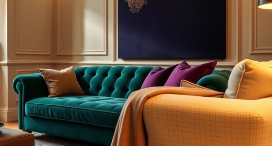
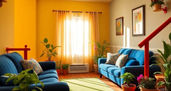
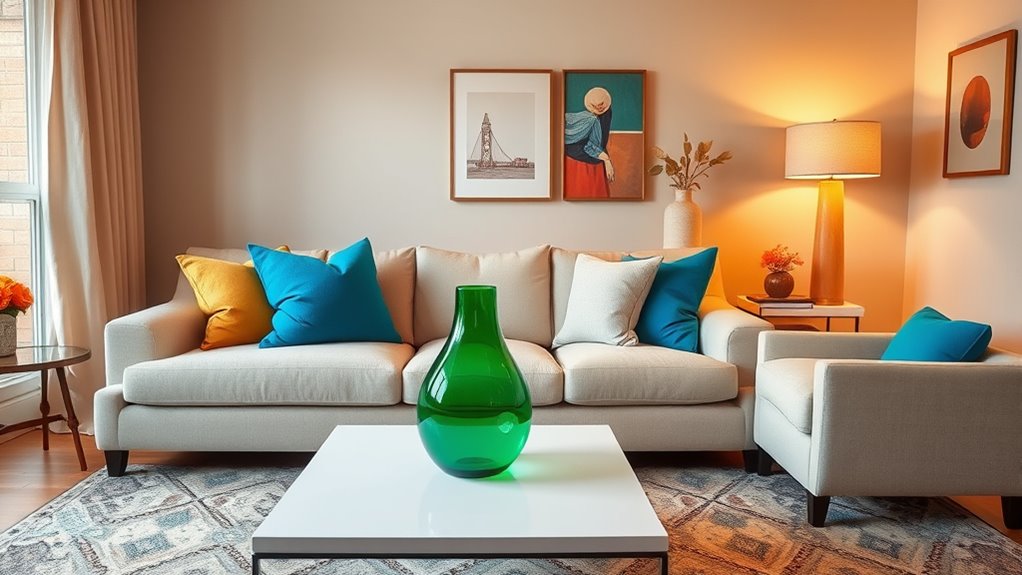
However, to truly make your decor pop, you also need to understand complementary contrasts. This involves pairing colors that sit opposite each other on the color wheel, such as blue and orange or red and green. When used thoughtfully, complementary contrasts create dynamic visual interest and energy in a space. You might keep the majority of your decor in neutral tones or a monochromatic scheme and use pops of contrasting color as accents. For instance, a neutral room with pops of bright orange cushions or a green vase can instantly draw the eye, adding vibrancy without overwhelming the overall aesthetic. These contrasts work because they emphasize each other, making both colors appear richer and more vivid.
Using monochromatic palettes and complementary contrasts together offers a versatile strategy for creating design harmony while adding eye-catching accents. You can build a base of calming, unified shades and then introduce contrasting accents to energize the space. This approach allows you to control the visual weight of each element, ensuring your decor feels balanced yet lively. When choosing accents, consider their placement and scale—small touches like throw pillows, artwork, or decorative objects can make a significant difference. The key is to be intentional with your color choices, ensuring the contrasting accents enhance rather than clash with the monochromatic foundation.
Ultimately, mastering the use of monochromatic palettes and complementary contrasts empowers you to craft spaces that are both cohesive and mesmerizing. It’s about striking the right balance: creating harmony with a unified color story, then adding strategic pops of contrasting color to keep the eye moving and the decor feeling fresh. With this knowledge, you’ll be able to design rooms that are visually compelling, expressive, and perfectly tailored to your personal style.

Lcokin Multicolored Rainbow Abstract Throw Pillow Covers 18×18 in Set of 2, Decor Art Vibrant Pillow Case Square Cushion Covers for Sofa Bed Couch Living Room
【Soft Material】: The Multicolored Rainbow Set Of 2 Decorative Pillow Covers Are Crafted From High Quality Polyester, Very…
As an affiliate, we earn on qualifying purchases.
As an affiliate, we earn on qualifying purchases.
Frequently Asked Questions
How Do I Choose the Right Accent Color for My Space?
When choosing the right accent color, consider color psychology to evoke the mood you want. Think about where you’ll place the accents—focal points like walls or accessories—and how they’ll complement your main colors. You should also test small swatches to see how different hues work with your lighting. This approach helps you pick an accent that enhances your space, creating a balanced and lively atmosphere.
Can Pops of Color Work in Small or Minimalist Rooms?
You might think pops of color overwhelm small or minimalist rooms, but they actually work well when balanced with neutral palettes. Bold contrasts draw attention without cluttering space, making your decor lively yet simple. Use small accents like pillows or artwork to add personality without overwhelming the room. So, yes, pops of color can enhance small or minimalist spaces, creating visual interest while maintaining a clean, harmonious look.
What Are Some Common Mistakes When Adding Accents?
When adding accents, you should avoid common mistakes like overusing bold hues or ignoring accent color psychology. Mixing too many bold colors can overwhelm your space and create visual chaos. Instead, pick one or two accent shades that complement your main palette. Focus on balance, and remember, subtle accents often make a stronger impact. Keep it simple, intentional, and let your accents enhance the overall vibe.
How Do I Balance Multiple Accent Colors Effectively?
Balancing multiple accent colors might seem like a jigsaw puzzle with too many pieces, but it’s all about color harmony and accent layering. You’ll want to pick a dominant hue and use others sparingly. Think of your accents as supporting actors, not leads. Mix textures and shades carefully, ensuring they complement rather than clash. This way, your decor feels cohesive, vibrant, and effortlessly stylish—like a perfectly choreographed dance of colors.
Are There Seasonal or Trend-Based Accent Color Ideas?
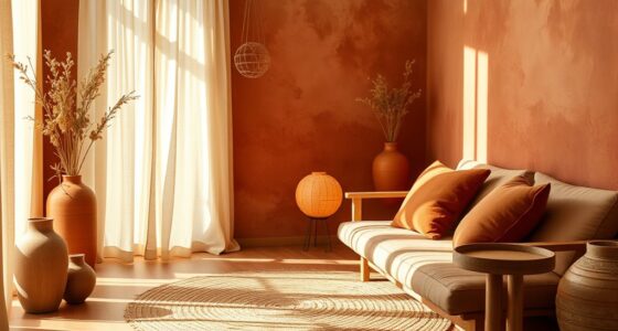
You can keep your decor fresh by exploring seasonal color palettes, which reflect the changing nature and mood of each season, or by incorporating trend-inspired accents that follow current design movements. For example, warm earthy tones work well in fall, while bright, vibrant shades suit summer. Mix and match these trend-inspired accents with your existing decor to create a dynamic, seasonally appropriate look that feels stylish and inviting year-round.

Glasseam Glass Bud Vases for Flower: 5 Colorful Small Vases Set with Rustic Wooden Tray for Home Office Living Room Bathroom – Vintage Table Centerpieces for Birthdays Wedding Housewarming Gifts
Elegant Bud Vase Wood Tray Set: This exquisite small glass vases set is ideal for those seeking effortless…
As an affiliate, we earn on qualifying purchases.
As an affiliate, we earn on qualifying purchases.
Conclusion
Incorporating pops of color into your decor is like adding a splash of sunlight to a cloudy day—it instantly lifts the mood and brings your space to life. These accents aren’t just small details; they’re the sparks that ignite your personality and style. So don’t be afraid to experiment and let your personality shine through. When you choose the right pops of color, you’re painting your home with the vibrant brushstrokes of your unique story.
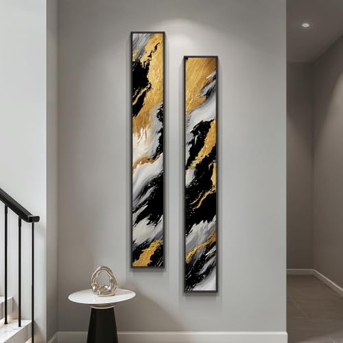
Framed Long Narrow Vertical Abstract Wall Art Set, 2 Piece Black White Gold Luxury Modern Canvas Prints Paintings Artwork for Walls, Pictures for Entryway Hallway Living Room Dining Bedroom Wall Decor
[Framed Wall art]: Set of 2 pieces contemporary large framed luxury black white gold vertical long narrow abstract…
As an affiliate, we earn on qualifying purchases.
As an affiliate, we earn on qualifying purchases.

Color Me Floral: Stunning Monochromatic Arrangements for Every Season
As an affiliate, we earn on qualifying purchases.
As an affiliate, we earn on qualifying purchases.