
Muted earth tones like soft terracotta, olive, and dusky sienna create a versatile and calming palette that brings natural elegance and warmth to your space or wardrobe. These shades evoke a sense of authenticity and timeless beauty, blending effortlessly to produce harmonious environments. You can mix them with whites, creams, or deeper hues for contrast or texture. To discover how these colors can transform your aesthetic, explore more beyond the surface.
Key Takeaways
- Muted earth tones like soft terracotta, olive, and dusky sienna evoke natural elegance and timeless appeal in design and fashion.
- These colors create harmonious palettes that blend seamlessly with whites, creams, and natural textures for versatile styling.
- Inspired by traditional pigments from minerals and plants, they symbolize stability, humility, and a connection to nature.
- They suit both minimalist and maximalist aesthetics, serving as neutral backgrounds or standalone statement colors.
- Incorporating tactile materials like linen, wood, and ceramics enhances their warm, grounded, and refined aesthetic.
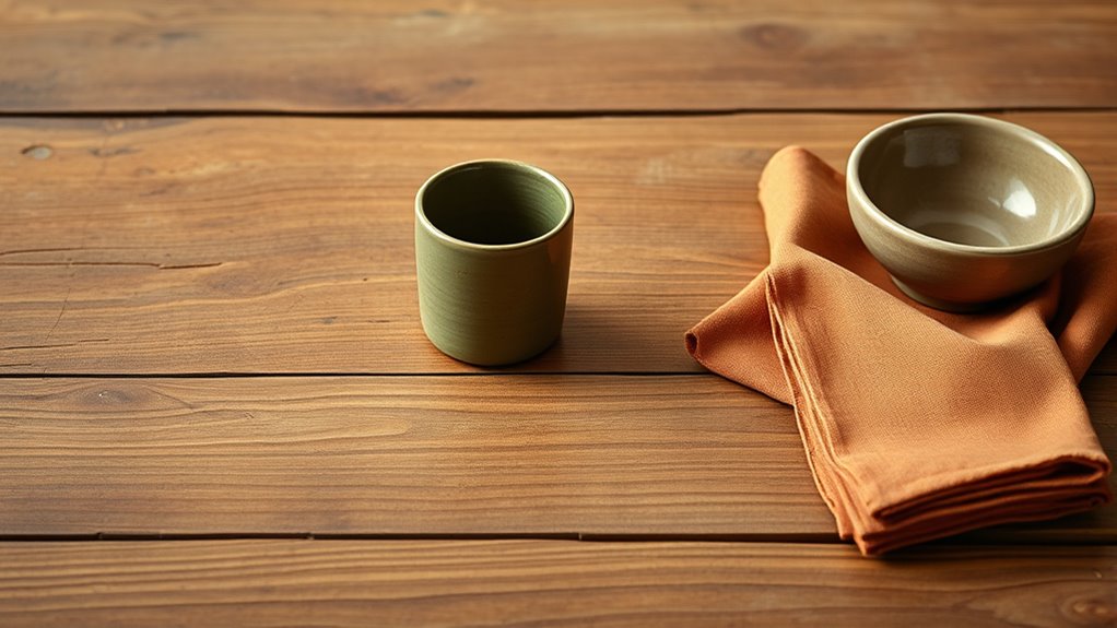
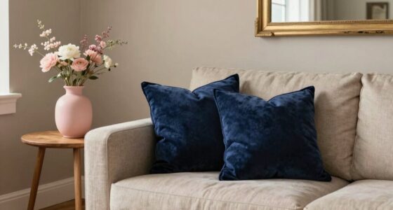
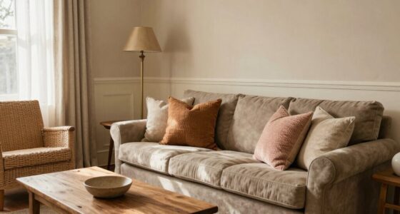
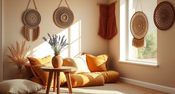
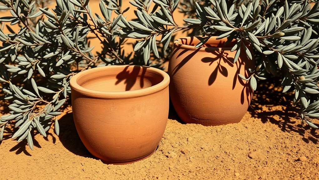
Muted earth tones have gained popularity for their calming and versatile appeal, making them a staple in interior design and fashion. These subdued shades, like soft terracotta, olive, and dusky sienna, evoke a natural elegance that’s both timeless and contemporary. If you’re looking to incorporate these hues into your space or wardrobe, understanding color pairing tips can help you create balanced and harmonious looks. Earth tones naturally complement each other, so pairing a soft terracotta with olive green can produce a warm, inviting palette. For contrast, adding crisp whites or muted creams can brighten the overall aesthetic without overpowering the subtlety of the earth tones. When combining deeper shades like dusky sienna, consider lighter accents such as beige or soft blush to prevent the design from feeling heavy. Layering textures—think linen, jute, or matte ceramics—also enhances the tactile richness of earth tones, making your environment feel cozy yet sophisticated. Incorporating natural materials like wood and stone further deepens the earthy feel and adds authenticity to your decor. To truly appreciate these hues, it’s helpful to understand the history of earth tones. Historically, these shades have been rooted in nature and traditional craftsmanship. Indigenous cultures and ancient civilizations used natural pigments derived from minerals, plants, and clay to create durable dyes and paints. Over centuries, earth tones became associated with stability, humility, and connection to the land. In modern times, the resurgence of earth tones reflects a desire for authenticity and grounding amidst a fast-paced world. Designers and artists have long favored these muted shades for their ability to evoke warmth, serenity, and a sense of history. By embracing the story behind earth tones, you can make more intentional choices in your aesthetic, whether you’re decorating a home or updating your wardrobe. Furthermore, earth tones are inherently versatile, working well in both minimalist and maximalist settings. They serve as excellent neutrals, allowing you to build layers of contrasting textures and subtle patterns without clashing. When you incorporate soft terracotta, olive, or dusky sienna, you’re tapping into a color palette that is both soothing and expressive. These shades can act as a canvas for bold accents or stand alone for a more understated look. Whether you’re choosing paint colors, upholstery, or accessories, think about how these hues interact with natural light and other elements in your space. With the right color pairing tips and a nod to their rich history, you can craft an environment or style that feels both grounded and refined.
muted earth tone throw pillows
As an affiliate, we earn on qualifying purchases.
As an affiliate, we earn on qualifying purchases.
Frequently Asked Questions
How Can I Incorporate Muted Earth Tones Into Small Spaces Effectively?
To incorporate muted earth tones into small spaces effectively, start by layering textures like woven rugs, linen curtains, and wooden accents to add depth. Balance brightness by adding light-colored accessories or subtle metallic accents that reflect light, preventing the space from feeling dull. Use these tones on walls or furniture, then introduce brighter elements sparingly to keep the room lively. This approach makes your small space feel cozy yet vibrant.
What Are the Best Complementary Colors for Muted Terracotta and Olive Palettes?
Did you know that 85% of interior designers recommend contrasting accent colors to enhance muted palettes? For terracotta, try deep navy or charcoal to create striking contrast, while blush pink or soft cream works beautifully with olive for a fresh look. Use strategic color pairing strategies, like balancing warm tones with cool accents, to add depth and sophistication to your space without overwhelming its subtle charm.
Are Muted Earth Tones Suitable for Outdoor Landscaping and Decor?
Muted earth tones are perfect for outdoor landscaping and decor because they create a natural, calming vibe. You can use these colors for garden pathways, blending seamlessly with plants and stones, and for outdoor furniture, adding warmth without overpowering the space. Their subtle hues help your outdoor area feel inviting and harmonious, making it easier for you to enjoy cozy gatherings or peaceful moments surrounded by nature’s beauty.
How Do Muted Earth Tones Influence Mood and Interior Ambiance?
Muted earth tones positively influence your mood and interior ambiance by creating a calming, grounded environment. Their color psychology promotes relaxation and stability, making spaces feel cozy and inviting. You can also appreciate their historical influences, which evoke timeless elegance and connection to nature. Using these tones helps you craft a serene atmosphere that encourages comfort, mindfulness, and a sense of harmony within your home.
What Are Common Mistakes to Avoid When Using Muted Earth Tones?
Did you know that 65% of interior design mistakes stem from poor color pairing? When using muted earth tones, avoid clashing hues or overly bright accents. Focus on lighting considerations—natural light enhances their warmth, while harsh artificial light can dull their charm. Don’t overuse these shades; balance them with neutral or contrasting colors to create harmony. Keep these tips in mind, and you’ll achieve a cozy, inviting space.

Mitt&Ditt Ceramic Flower Vase with Handles, 11 inch Tall Vase for Centerpieces, Large Decorative Terracotta Vases, Farmhouse Rustic Vases for Home Decor, Living Room, Table, Neutral
【Non-Slip Bottom Neutral Vase】 The large vases for decor living room is 11 inches tall and 6.3 inches…
As an affiliate, we earn on qualifying purchases.
As an affiliate, we earn on qualifying purchases.
Conclusion
Embracing muted earth tones like soft terracotta, olive, and dusky sienna can transform your space into a calming sanctuary. Imagine a cozy living room where these colors create a sophisticated yet inviting atmosphere, encouraging relaxation after a busy day. For instance, a boutique hotel used these hues to evoke warmth and elegance, earning rave reviews from guests. Incorporate these palettes, and you’ll craft a timeless, soothing environment that effortlessly balances style and comfort.

MIULEE Faux Linen Curtains 84 Inch Length 2 Panels Natural Olive Green Semi Sheer Curtain with Back Tab Rod Pocket, Light Filtering Window Privacy Burlap Drapes for Living Room Bedroom 42W x 84L
Ready Made: The package includes 2 panels of thick linen semi sheer curtains, and each panel 42"W (84"W…
As an affiliate, we earn on qualifying purchases.
As an affiliate, we earn on qualifying purchases.

ALL-IN-ONE Paint by Heirloom Traditions, Brick (Burnt Cinnamon), Quart – Durable cabinet and furniture paint. Built in primer and top coat, no sanding needed. Includes our 30 featured color card.
Includes 30 featured and newest released color card. Sprayed on color to see our colors in your homes…
As an affiliate, we earn on qualifying purchases.
As an affiliate, we earn on qualifying purchases.