
Enhancing navigation for visual impairments involves using strong contrast with bright, bold colors and textured surfaces to provide clear visual and tactile cues. You can distinguish between floors, walls, and hazards through color differences, while textured strips and raised patterns guide your path and alert you to stairs or edges. Combining contrast with tactile feedback creates a seamless experience, helping you navigate safely and independently—keep exploring to discover how these strategies can transform your environment.
Key Takeaways
- High-contrast color schemes enhance visual clarity, making signs, pathways, and hazards easily distinguishable for visually impaired individuals.
- Tactile textures like embossed patterns, Braille, and textured strips provide physical cues to confirm locations and guide navigation.
- Combining contrasting colors with tactile textures reinforces environmental cues, improving recognition and understanding through multiple senses.
- Designing environments with accessible contrast ratios and tactile feedback promotes safety, independence, and inclusivity for all users.
- Integrating contrast and texture in public spaces reduces reliance on assistance, fostering confidence and ease of navigation for those with visual impairments.

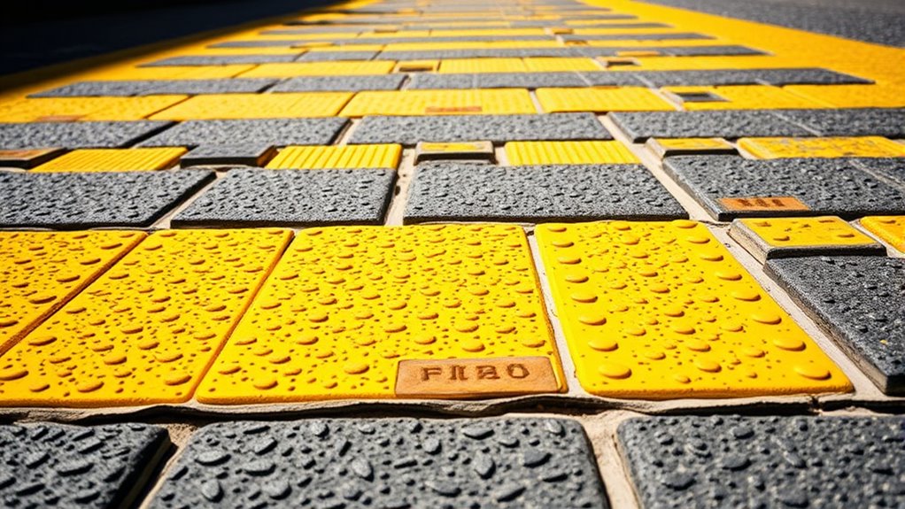
Have you ever noticed how contrast and texture can transform a simple image into something striking? When it comes to navigation for people with visual impairments, these elements play an essential role in making environments safer and more accessible. By focusing on color differentiation and tactile feedback, you can create spaces that communicate information clearly without relying solely on sight. Color differentiation involves using distinct hues and shades to highlight boundaries, pathways, or important features. For example, contrasting colors between the floor and walls or between stairs and ramps help you quickly identify changes in terrain. Bright, bold colors paired with darker backgrounds can make signs, buttons, or hazards stand out, reducing confusion and preventing accidents. Tactile feedback, on the other hand, provides physical cues that confirm your location or alert you to obstacles. Textured surfaces—like raised patterns on flooring, Braille signage, or embossed indicators—give you a sense of touch that guides your movements confidently. When tactile feedback is integrated thoughtfully, you can differentiate between different zones or identify key fixtures without needing to see them. Combining color differentiation with tactile feedback creates a layered approach, reinforcing each cue through multiple senses. This synergy is especially effective in public spaces, where quick recognition is crucial. For example, a textured strip with a high-contrast color can lead you along a pathway, signaling safe navigation routes. Similarly, tactile warning strips near stairs or platform edges alert you to potential hazards, while contrasting colors draw your attention to important information. Additionally, understanding how contrast ratios influence visual clarity can help in designing more effective environments for all users. As a user, these design choices empower you to navigate independently and with assurance. They reduce reliance on other people or assistive devices, fostering greater confidence and autonomy. For designers and architects, understanding the importance of contrast and texture means creating environments that are inclusive by default. Using high-contrast color schemes and tactile cues doesn’t just benefit individuals with visual impairments; it often enhances overall safety and usability for everyone. Think about how a tactile, textured surface combined with bold color contrast can make a busy train station or a hospital safer and more navigable. It’s about leveraging sensory differences to communicate essential information clearly and effectively. By prioritizing these elements, you’re not only improving accessibility but also demonstrating a commitment to universal design. It’s a simple yet powerful way to ensure that everyone, regardless of visual ability, can find their way with confidence, comfort, and independence.
Frequently Asked Questions
How Do Contrast and Texture Affect Auditory Navigation Tools?
Contrast and texture enhance auditory navigation tools by providing tactile feedback and clearer audio cues. You’ll notice that high contrast helps you distinguish objects and pathways more easily, while textured surfaces offer tactile signals that complement audio cues. These features work together, allowing you to better interpret your environment and navigate confidently, especially when auditory cues are combined with tactile feedback, making your experience safer and more intuitive.
What Are the Best Practices for Testing Contrast in Real-World Environments?
Think of testing contrast like tuning a musical instrument—you need precision. You should conduct user testing in various real-world environments, paying close attention to environmental lighting, which greatly influences contrast perception. Observe how users navigate under different conditions, gather feedback, and adjust accordingly. This hands-on approach guarantees your design remains effective across diverse settings, making navigation safer and more reliable for visually impaired users.
Can Texture Cues Substitute for High Contrast in Navigation Aids?
Texture cues can partially substitute for high contrast in navigation aids by providing tactile differentiation, helping you distinguish different surfaces or pathways through tactile feedback. While texture enhances spatial awareness, it doesn’t replace color perception, which offers visual contrast cues. Combining tactile differentiation with contrasting colors creates a more effective navigation system, ensuring you can rely on both tactile and visual cues for safer, more confident movement in varied environments.
How Does Contrast Impact Users With Combined Visual and Cognitive Impairments?
You’re in the driver’s seat when it comes to understanding how contrast impacts users with combined visual and cognitive impairments. Poor contrast hampers color differentiation and readability, making navigation a tall order. It’s like finding a needle in a haystack. By enhancing contrast, you improve clarity, helping users distinguish key features and process information faster. Good contrast isn’t just a nice-to-have; it’s a lifeline for inclusive, accessible navigation.
Are There Standardized Guidelines for Contrast and Texture in Accessible Design?
Yes, there are standardized standards for contrast and texture in accessible design. You should follow guidelines like the WCAG (Web Content Accessibility Guidelines), which specify minimum contrast ratios for visual compliance. These standards help guarantee your design is usable for people with visual impairments. By adhering to these guidelines, you improve navigation and accessibility, making your content more inclusive and easier to interpret for all users.
Conclusion
By enhancing contrast and texture, you turn your environment into a clear map, guiding your steps with confidence. Think of these elements as your visual signposts, lighting the way through a maze of obstacles. When you prioritize these simple yet powerful features, you’re not just improving navigation—you’re opening doors to independence and confidence. Like a lighthouse guiding ships safely home, thoughtful contrast and texture can illuminate your path and make every journey smoother.