
To use accent colors without overwhelming a senior space, choose soft, muted hues like gentle yellows, calming blues, or muted oranges that promote relaxation and happiness. Limit your palette to two or three complementary colors, and support safety by using high contrast for furniture and signage. Add pops of color through accessories like cushions or artwork to create visual interest without clutter. If you continue exploring, you’ll discover more ways to create a welcoming, balanced environment.
Key Takeaways
- Choose soft, muted hues like pastels to add color without overstimulation.
- Limit accent colors to two or three for visual harmony and clarity.
- Use contrasting but harmonious shades to enhance visibility while maintaining calmness.
- Incorporate accessories like cushions and artwork for pops of color without clutter.
- Prioritize color psychology to evoke positive emotions and create a welcoming atmosphere.
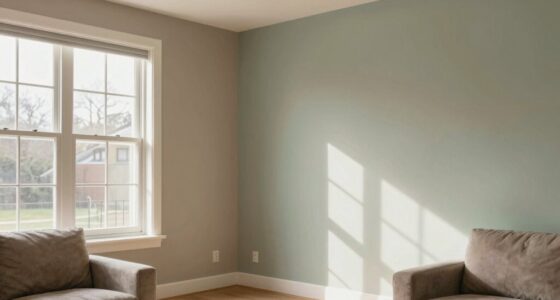
Have you ever wondered how to make senior spaces feel more inviting and lively? Using accent colors thoughtfully can transform a room, but it’s essential to strike the right balance. When choosing accent colors, consider color psychology to evoke positive emotions and create a welcoming atmosphere. Soft, warm hues like gentle yellows, muted oranges, and calming blues can promote feelings of happiness, comfort, and tranquility. These shades are subtle enough to energize the space without overwhelming it, helping residents feel relaxed and at ease. Bright, highly saturated colors might seem appealing, but they can be overstimulating, especially for seniors with sensory sensitivities. Instead, opting for more muted or pastel tones as accents provides a cheerful touch without causing visual fatigue.
Accessibility considerations are equally important when incorporating accent colors into senior spaces. You want to ensure that color choices support visibility and navigation. For instance, using contrasting colors for furniture, signage, or important features makes them stand out clearly against the background walls. This not only enhances safety but also helps those with visual impairments or age-related vision changes find their way around easily. When selecting accent colors, avoid overly complex patterns or subtle shades that blend into the background, as they can create confusion or frustration. Instead, use bold but harmonious contrasts that guide the eye naturally and make important areas or objects easy to identify. Incorporating color contrast principles can further improve accessibility and safety.
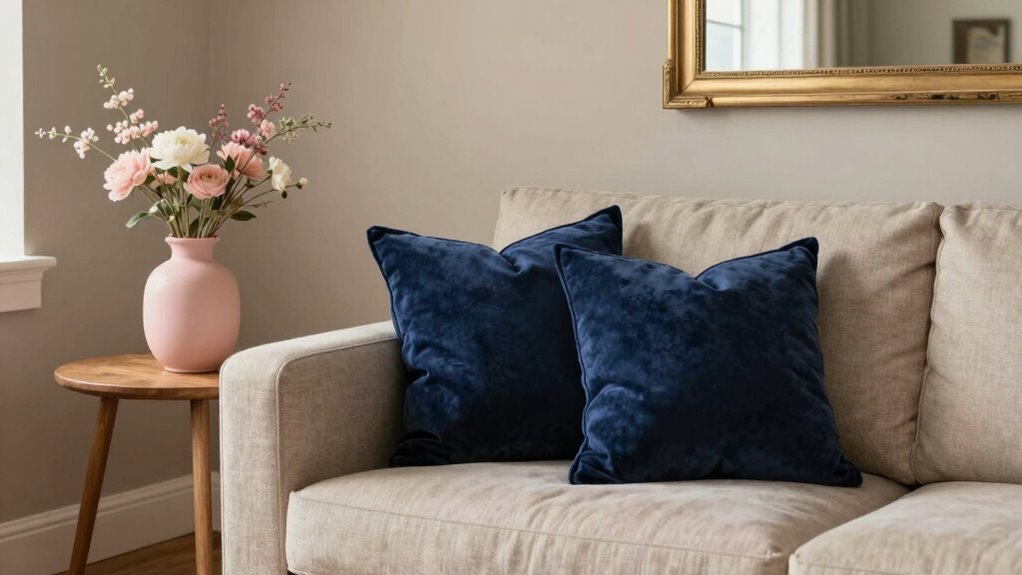
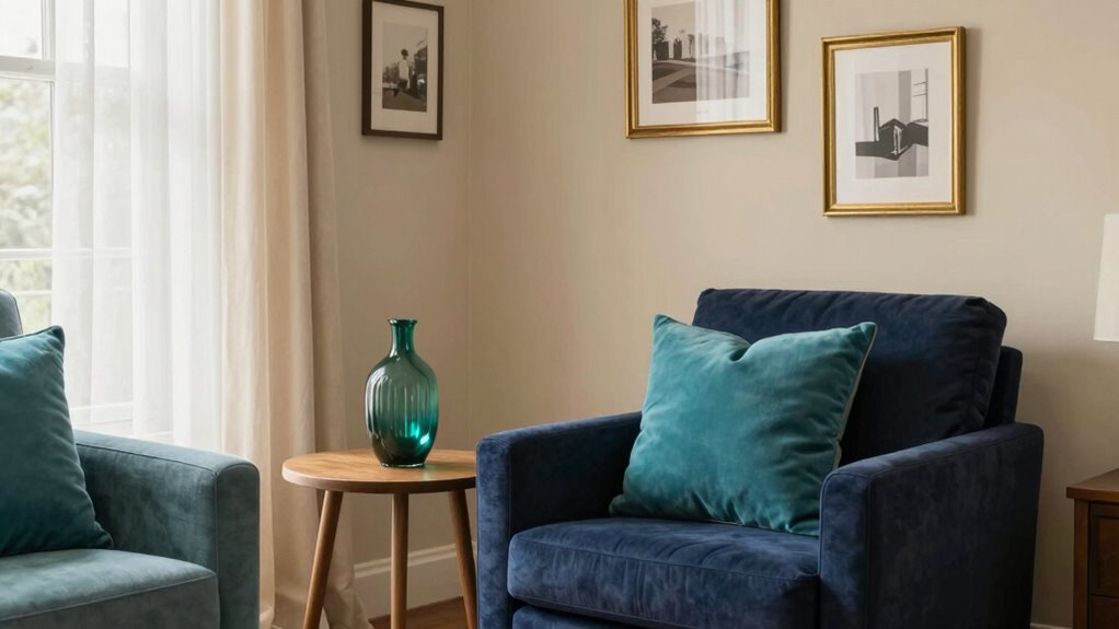
In addition to wall accents, think about how accessories like cushions, artwork, or rugs can introduce pops of color without dominating the space. These smaller touches allow you to experiment with different hues and styles, giving the room personality and vibrancy while maintaining a calm overall environment. Incorporating visual hierarchy through strategic placement of accent colors helps residents focus on key features without feeling overwhelmed. When combining accent colors, keep their number limited—two or three at most—to prevent visual clutter. Consistency in color schemes helps residents feel grounded and reduces cognitive overload, especially in environments where clarity and comfort are priorities.
Furthermore, understanding color psychology can help you choose hues that promote positive feelings and a sense of well-being among residents. Ultimately, the goal is to foster a space that feels lively yet peaceful. By applying principles of color psychology and accessibility considerations, you can choose accent colors that uplift without overwhelming. Think of them as gentle highlights that enhance the room’s atmosphere, making it both visually appealing and easy to navigate. When used thoughtfully, accent colors can breathe new life into senior spaces, encouraging a sense of joy, safety, and belonging for everyone who spends time there.

ALL-IN-ONE Paint by Heirloom Traditions, Oyster (Neutral Taupe), Quart – Durable cabinet and furniture paint. Built in primer and top coat, no sanding needed. Includes our 30 featured color card.
- Color Card Included: 30 featured and new colors with sample spray
- All-In-One Paint: No sanding, priming, or top coat needed
- Versatile Use: Suitable for interior and exterior hard surfaces
As an affiliate, we earn on qualifying purchases.
As an affiliate, we earn on qualifying purchases.
Frequently Asked Questions
How Do Accent Colors Affect Mood in Senior Spaces?
Accent colors greatly influence mood in senior spaces through color psychology and their emotional impact. Bright, warm hues like yellow or orange can energize and uplift, while calming blues and greens promote relaxation and serenity. When you choose accent colors carefully, you create a positive environment that supports emotional well-being. Balancing vibrant and muted shades ensures the space feels welcoming without becoming overwhelming, fostering comfort and emotional stability for seniors.
What Are the Best Accent Colors for Seniors With Visual Impairments?
You should choose high-contrast accent colors like deep blues, bright yellows, or rich reds, as studies show they improve visibility for those with visual impairments. Using color contrast helps seniors distinguish objects easily, reducing falls and confusion. Rely on color psychology—calming blues or energizing yellows—to create a supportive atmosphere. These choices guarantee your space is both functional and welcoming, fostering independence and comfort for seniors.
Can Accent Colors Help With Navigation in Senior Living Areas?
Yes, accent colors can improve navigation in senior living areas by leveraging color psychology and design consistency. You can use bold, contrasting colors on doors, handrails, or furniture to guide residents intuitively. Maintaining consistent color schemes helps prevent confusion, while strategic accents highlight key areas, making navigation easier and safer. This thoughtful approach enhances independence and comfort without overwhelming the space, creating a more accessible environment for seniors.
How Often Should Accent Colors Be Updated or Changed?
You should update accent colors seasonally or every 6 to 12 months to keep spaces fresh and engaging. Research shows that color psychology influences mood and behavior, so changing accents can boost well-being. Regular updates prevent color fatigue and help residents stay stimulated. Incorporate seasonal themes for a welcoming environment, ensuring your space remains vibrant without overwhelming seniors. Keep it simple, thoughtful, and aligned with residents’ preferences.
Are There Any Safety Concerns With Bright Accent Colors?
Bright accent colors generally don’t pose safety concerns if used thoughtfully. Color psychology shows vibrant hues can boost mood, but avoid overly stimulating shades that may cause agitation. Consider cultural significance too; some colors have specific meanings that could be misinterpreted. Make certain of contrast for visibility, especially for those with impaired vision. Balance bright accents with calming tones to create a safe, welcoming environment that enhances well-being without overwhelming.
Conclusion
So, you’ve learned how to add just the right touch of accent colors without overwhelming your senior space. But the real question is—what’s next? Will you dare to experiment with bold hues or stick to subtle shades? The choice is yours, and the possibilities are endless. Remember, sometimes the tiniest pop of color can make the biggest difference. Are you ready to transform your space and discover what’s truly possible? The decision is in your hands.