
Using color contrast at home helps you see surfaces and hazards more clearly, reducing the risk of falls. By choosing contrasting colors for stairs, edges, and rugs, you make key features stand out without attracting attention. Good lighting combined with high-contrast elements improves depth perception and visibility in different lighting conditions. These quiet, simple improvements can make your space safer without changing the overall look—keep going to discover even more ways to enhance your safety effortlessly.
Key Takeaways
- High-contrast colors distinguish surfaces, steps, and hazards, making them more visible and reducing fall risk.
- Consistent use of contrasting patterns creates a mental map, helping navigate safely and confidently.
- Bright, contrasting handrails and edges improve visibility and support stable movement.
- Proper lighting combined with color contrast highlights hazards under different lighting conditions.
- Clear visual cues through contrast enhance depth perception and awareness of surroundings.
Have you ever thought about how color contrast can impact your safety at home? It’s a subtle yet powerful factor that influences your visual perception, especially when lighting conditions change or when steering through unfamiliar areas. By understanding how contrasting colors work together, you can make your living space safer and reduce the risk of falls. When you optimize lighting and color contrast, your eyes can more easily distinguish between different surfaces, steps, and objects, giving you better depth perception and awareness of your surroundings.
Optimizing lighting and color contrast enhances safety by improving your ability to see and navigate your home confidently.
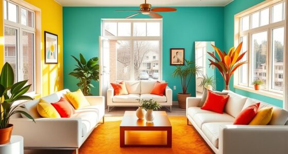
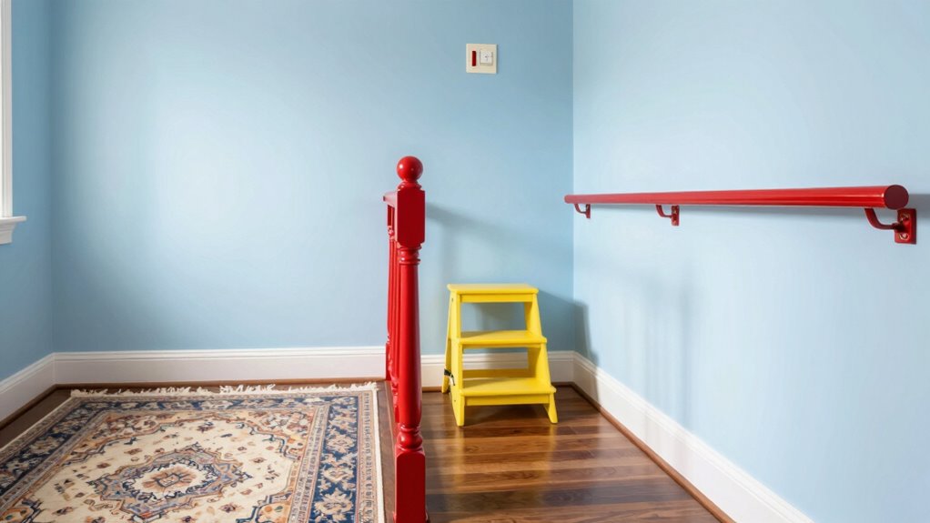
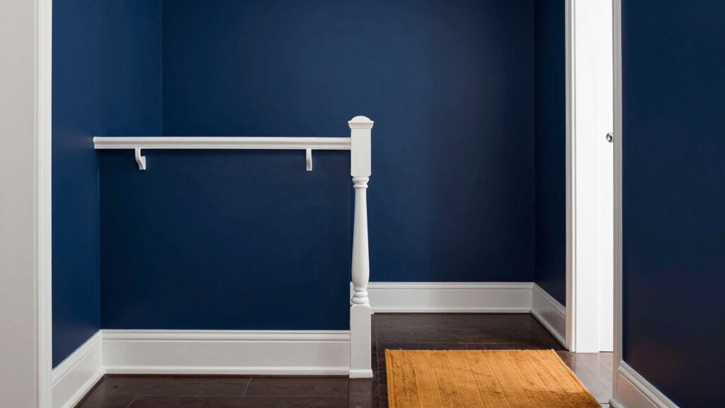
Lighting optimization plays a crucial role in this process. Well-placed lighting, combined with high-contrast colors, ensures that hazards are clearly visible. For example, if your stairs are painted in a color that sharply contrasts with the adjacent flooring, you’re less likely to miss a step, even in dim lighting. You might contemplate highlighting stair edges with a darker or more vivid color, which draws your attention immediately. This approach helps your brain process visual cues faster, making it easier to judge distances and avoid trips or slips.
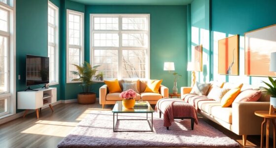
The key is to choose colors that stand out against their backgrounds. For instance, if your hallway floor is a light shade, adding dark rugs or contrasting trim can help define the space better. Similarly, installing handrails in a bright, contrasting hue against the wall makes them more noticeable, so you instinctively grasp them when needed. When surfaces and objects contrast clearly, your visual perception becomes sharper, allowing you to steer safely without second-guessing your footing. It’s not just about aesthetics; it’s about creating an environment that supports your natural vision and helps you move confidently. Understanding indoor air quality can also contribute to overall safety by ensuring a comfortable living environment that promotes better focus and alertness.
Another aspect to think about is the consistency of contrast throughout your home. If certain areas have high contrast, maintain that pattern elsewhere to build a mental map of your space, reducing confusion and hesitation. For example, if your bathroom tiles are dark and the fixtures are light, keep the same principle in other rooms. This consistency minimizes the cognitive load on your visual perception, making it easier to recognize hazards instantly. Recognizing visual cues and how they influence movement can further enhance your safety measures. Additionally, understanding how lighting and color contrast interact can help you make better choices for safety improvements around your home, especially when considering visual perception and how your brain interprets visual information. Being mindful of environmental factors, such as glare or shadows, can also improve overall safety by reducing visual distractions.

COSIMIXO 4" x 35Ft Black&Yellow Heavy Duty Anti Slip Tape for Stairs Outdoor/Indoor Waterproof Grip Tape Safety Non Skid Roll for Stair Steps Traction Tread Staircases Anti-Slip Strips…
- Premium Non-Slip Tape: Black and yellow, 4x35ft, high adhesion
- Versatile Usage: Suitable for stairs, floors, ramps, and equipment
- Easy Installation: Cut, peel, and stick; no residue or damage
As an affiliate, we earn on qualifying purchases.
As an affiliate, we earn on qualifying purchases.
Frequently Asked Questions
How Do I Choose the Best Color Combinations for My Home?
To choose the best color combinations for your home, start with decorating tips that prioritize high contrast between floors, walls, and furniture. Use color psychology to select soothing or energizing hues that match each space’s purpose. Opt for bold, contrasting colors in areas where safety is a concern, like stairways, to enhance visibility. Balance these choices with your personal style for a inviting, safe environment.
Are There Specific Colors That Are More Effective for Contrast?
Bright, high-contrast colors like deep blues, reds, or blacks against lighter backgrounds are most effective for enhancing color perception and supporting visual acuity. These combinations help you distinguish edges and steps clearly, reducing the risk of falls. Focus on contrasting hues for stairs, door frames, and furniture. By choosing colors that stand out, you make your environment safer, especially if you or your loved ones have vision challenges.
How Often Should I Reassess My Home’s Color Contrast?
Like a trusty knight, you should reassess your home’s color contrast every year or so. When you make lighting improvements or furniture placement changes, it’s a perfect time to verify. Regular checks ensure contrast remains effective, especially in high-traffic or dimly lit areas. Staying vigilant helps prevent falls, making your home safer. Keep your environment visually clear, and enjoy peace of mind knowing you’re proactively protecting yourself.
Can Color Contrast Help Children or Only Seniors?
Color contrast can benefit children as well as seniors by supporting their visual development and color perception. For children, clear contrast helps them identify edges and objects, aiding their learning and safety. Seniors with declining vision also gain from high contrast environments, which reduce fall risks. So, using contrasting colors at home is a smart way to promote safety across all ages, fostering better visual clarity and preventing accidents.
What Other Fall Prevention Methods Complement Color Contrast?
You can bolster safety by pairing color contrast with subtle lighting enhancements and strategic furniture placement. These gentle measures help you navigate your space more confidently, reducing risks that might otherwise go unnoticed. Proper lighting brightens dark corners, while thoughtful furniture placement creates clear pathways. Together, these methods weave a safety net, quietly supporting your independence and preventing falls without making your home feel restrictive or clinical.
Conclusion
By simply adding contrast, you can make your home safer without loud alarms or costly modifications. When you distinguish stairs from the floor, you create a silent safeguard that guides your steps and quiets your worries. It’s a gentle reminder that small changes often carry the greatest weight. So, while color contrast may seem subtle, it quietly stands guard, offering peace of mind and preventing falls—because sometimes, the quietest solutions are the most powerful.