
Choosing the right colors can make a big difference in supporting memory and safety for those with dementia. Bright, contrasting hues help residents recognize objects and navigate spaces more easily, while calming shades create a soothing environment that reduces anxiety. Warm colors like yellows evoke comfort, and cool tones like blues promote relaxation. Using consistent, simple color schemes with visual cues can boost independence—if you want to discover more practical tips, continue exploring options to create welcoming, memory-friendly spaces.
Key Takeaways
- Bright, distinctive colors on doors and signage serve as visual cues to improve wayfinding and memory recall.
- Warm hues like yellow and orange create welcoming environments that reduce anxiety and promote comfort.
- High contrast color schemes differentiate walls, floors, and furniture, aiding spatial awareness and safety.
- Calm, cool colors such as blues and greens foster relaxation, supporting emotional well-being and memory retention.
- Consistent, simple color palettes prevent confusion and help residents recognize and navigate their environment easily.
Choosing the right color schemes is essential for creating safe and supportive environments for people with dementia. When you pay attention to color contrast and color psychology, you can considerably improve daily life and reduce confusion. High contrast between walls, floors, and furniture helps individuals distinguish different objects and spaces more easily. For example, using a darker shade on the floor and a lighter color on walls creates a clear visual boundary, making navigation safer and less stressful. This contrast minimizes the risk of falls and helps individuals recognize where they are, promoting independence and confidence.
High contrast colors improve safety and navigation for people with dementia.
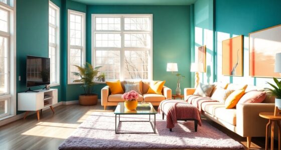
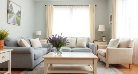
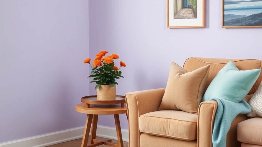
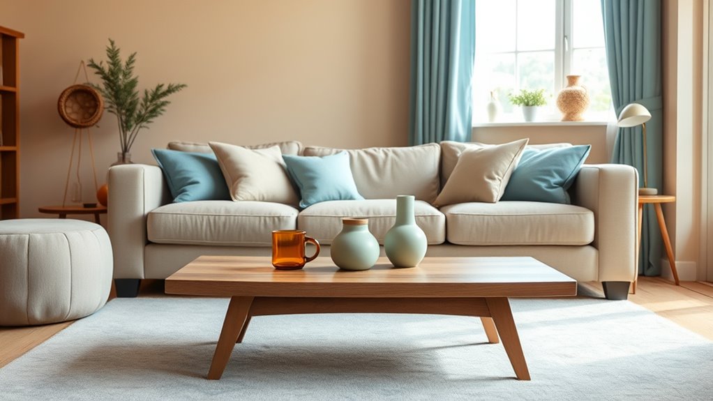
Color psychology plays an important role in designing dementia-friendly spaces. You might not realize it, but colors influence emotions and behavior. Warm hues like soft yellows and gentle oranges can evoke feelings of comfort and warmth, making a space feel welcoming. On the other hand, cool colors such as blues and greens tend to promote calmness and relaxation, which can reduce agitation or anxiety. When choosing colors, think about how they impact mood and behavior—calmer environments can help individuals with dementia feel more secure and less overwhelmed.
You should also consider how specific colors can support memory. Bright, distinctive colors can serve as visual cues, helping individuals recognize particular areas or items. For instance, painting the door to the bathroom in a vibrant color makes it more noticeable, aiding in wayfinding. Similarly, using contrasting colors on furniture or signage can guide residents to important areas without confusion. These cues are simple but effective tools that leverage color contrast and psychology to create intuitive spaces, reducing frustration and supporting orientation.
Additionally, incorporating color schemes that are familiar and culturally appropriate can enhance comfort and recognition for residents. Consistency in color schemes is key. When you stick to a simple palette with intentional contrast, it helps prevent sensory overload and confusion. Avoid overly busy or mismatched colors that can distract or unsettle. Instead, opt for a limited, harmonious set of colors that are easy on the eyes and serve specific functions. For example, uniform wall colors with contrasting trim or furniture help individuals focus on what’s important, like a chair or a doorway. This consistency makes the environment more predictable and less intimidating, which is essential for those with cognitive impairments.

Color Matching Dementia Activities for Seniors, Easy Memory Games for Alzheimers Patients, Cognitive Craft Gifts for Elderly Women, Large Puzzle Fidget Sensory Busy Board Gadgets
【SOOTHE ANXIETY】People with dementia or Alzheimer often struggle with anxiety and boredom. As seniors focus on aligning blocks…
As an affiliate, we earn on qualifying purchases.
As an affiliate, we earn on qualifying purchases.
Frequently Asked Questions
How Do Color Preferences Vary Among Individuals With Dementia?
You might notice that personal color preferences vary among individuals with dementia, influenced by their past experiences and memories. Cultural color associations also play a role, as certain hues may evoke specific emotions or memories depending on their background. It’s important to take into account both personal and cultural factors when choosing colors, ensuring they create a positive and comfortable environment that supports their well-being and familiarity.
Can Color Schemes Improve Navigation in Dementia Care Facilities?
You can improve navigation in dementia care facilities by using thoughtful color schemes. Incorporate strong color contrast and clear visual cues to help residents distinguish different areas easily. Bright, contrasting colors on doors, hallways, and furniture guide them intuitively, reducing confusion and promoting independence. By designing with these principles, you create a safer environment where residents can move around confidently, using visual cues as helpful landmarks.
Are There Specific Colors to Avoid for Dementia-Friendly Environments?
Avoiding certain colors is like steering clear of obstacles; it helps prevent confusion. You should avoid colors with low contrast, like brown and beige, as they blend into backgrounds and cause disorientation. Also, consider cultural color significance, since some hues may carry negative connotations. By paying attention to color contrast and cultural meanings, you create a safer, more comfortable environment for those with dementia.
How Does Lighting Affect the Perception of Color in Dementia Patients?
Lighting impact plays a vital role in how dementia patients perceive colors, affecting their visual perception. You should guarantee the environment has ample, even lighting to reduce shadows and glare, which can cause confusion or distress. Proper lighting helps colors appear more true, making it easier for patients to recognize objects and navigate safely. By optimizing lighting, you enhance their comfort and independence, supporting their daily needs and overall well-being.
What Training Is Needed for Staff to Implement Color-Based Cues Effectively?
You need staff training focused on understanding color perception in dementia patients. This training should teach staff how lighting affects color recognition and how to use color cues effectively to support orientation and memory. By learning about the importance of hue and contrast, your team can implement dementia-friendly color schemes confidently. Proper training guarantees they recognize individual needs and adapt cues, creating a safer, more supportive environment for those with memory challenges.

Smartsign S-6000-PL-14 "Notice: Door Must Remain Closed at All Times" Plastic Sign, Bilingual, 14" x 10", Black/Blue on White
DURABLE PLASTIC. Signs use 55 mil thick HDPE (high density polyethylene) and can last up to 2 years…
As an affiliate, we earn on qualifying purchases.
As an affiliate, we earn on qualifying purchases.
Conclusion
By choosing the right colors, you can create a more supportive environment for those with dementia. Using hues that contrast and evoke familiarity helps reinforce memory and navigation. Think of it like a visual map guiding them effortlessly through daily life. When you incorporate dementia-friendly colors thoughtfully, you’re not just decorating—you’re making a meaningful difference, helping loved ones feel more confident, safe, and connected in their surroundings.
calming blue green wall paint for dementia
As an affiliate, we earn on qualifying purchases.
As an affiliate, we earn on qualifying purchases.
visual cue furniture for dementia
As an affiliate, we earn on qualifying purchases.
As an affiliate, we earn on qualifying purchases.