
To guarantee your digital content is accessible and safe for everyone, you need to prioritize proper color contrast. Use standards like WCAG’s recommended ratios to make sure text stands out from backgrounds, especially for users with color vision deficiencies. Avoid relying only on color cues by adding patterns or labels. Applying high contrast colors improves visibility in various environments, creating an inclusive experience for all. Keep exploring to discover effective ways to optimize your color choices and enhance safety.
Key Takeaways
- Ensuring a contrast ratio of at least 4.5:1 for normal text and 7:1 for large text enhances readability for all users.
- Using high-contrast color combinations helps improve visibility, especially for users with color vision deficiencies.
- Avoid relying solely on color; incorporate patterns, icons, or text labels to convey information inclusively.
- Regularly test color choices with accessibility tools to verify they meet contrast standards and are perceivable by diverse users.
- Promoting inclusive color contrast practices supports safety, comprehension, and compliance with accessibility guidelines.
Have you ever struggled to read text on a website because of poor color choices? If so, you’re not alone. Many people face challenges when colors don’t provide enough contrast, especially those with color vision deficiencies. These visual impairments can make it difficult to distinguish between certain hues, leading to frustration and even safety issues. That’s why understanding and applying contrast ratio standards is essential for creating accessible digital content. The contrast ratio measures the difference in luminance between text and its background, ensuring that content is visible to everyone. The Web Content Accessibility Guidelines (WCAG) recommend specific contrast ratios—at least 4.5:1 for normal text and 7:1 for large text—to make sure content remains legible for users with various visual abilities.
Ensuring sufficient contrast ratio is key to making digital content accessible for all users.
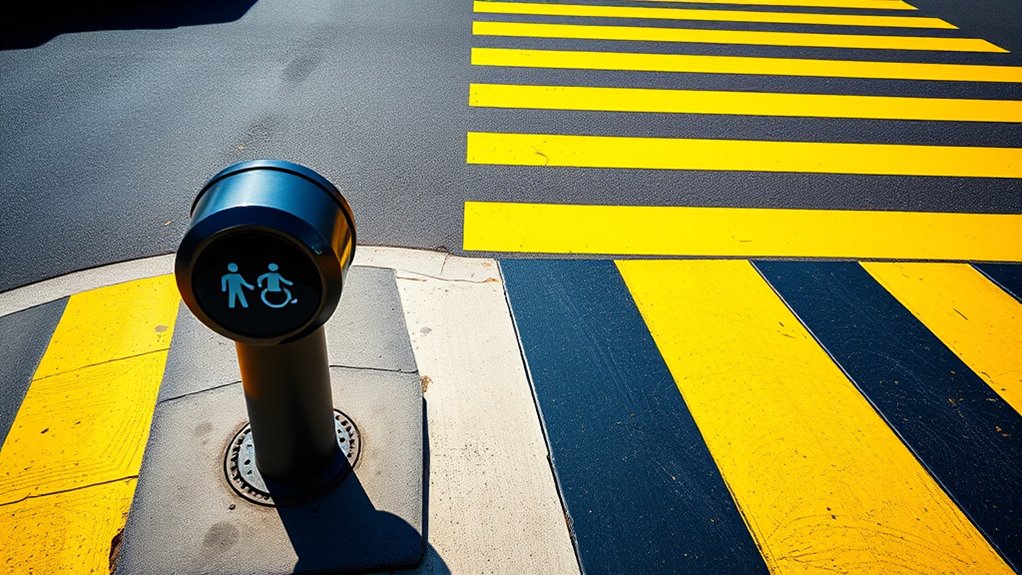
When designing for accessibility, you need to be mindful of color vision deficiencies, which affect a significant portion of the population. Common types include protanopia, deuteranopia, and tritanopia, each impacting how individuals perceive colors differently. For instance, someone with deuteranopia might not distinguish between certain shades of green and red, making color-based cues ineffective. To address this, you should avoid relying solely on color to convey information. Instead, incorporate other visual cues like patterns, icons, or text labels. This approach ensures that users with color vision deficiencies can navigate and understand your website without confusion or missed information.
Applying contrast ratio standards isn’t just about compliance; it’s about creating a better user experience for everyone. When you use high contrast colors, you make your content easier to read and understand. Simple steps like choosing dark text on a light background or vice versa can dramatically improve visibility. Many tools are available to help you test your color choices against accessibility standards, so you can verify that your contrasts meet or exceed those recommended levels. Consistently maintaining proper contrast not only helps users with disabilities but also benefits everyone in bright sunlight or on small screens where visibility can be compromised. Moreover, fostering awareness of visual accessibility principles encourages more inclusive design practices across projects.
Ultimately, accessible color contrast is about inclusivity. By thoughtfully selecting colors that meet contrast ratio standards and considering color vision deficiencies, you ensure your website or product is usable by a wider audience. It shows that you value all users’ needs and are committed to making information accessible and safe. Taking these steps isn’t just a technical requirement—it’s a fundamental part of creating a respectful, user-friendly digital environment. When you prioritize contrast and accessibility, you enhance visibility and safety for everyone who interacts with your content.

DGK Color Tools High Resolution 8.5×11 Chrome SD Professional Lens Test Chart, 3-Pack
SUPERIOR IMAGE QUALITY – Achieve optimal lens performance with these high-resolution charts, ensuring your photos and videos are…
As an affiliate, we earn on qualifying purchases.
As an affiliate, we earn on qualifying purchases.
Frequently Asked Questions
How Do Color Contrast Standards Differ Internationally?
International standards for color contrast differ, so you need to guarantee cross border compliance. Countries like the US follow WCAG guidelines, requiring a minimum contrast ratio, while the EU has its own standards for accessibility. You should check each region’s specific regulations to ensure your designs meet local requirements. By understanding these differences, you can create visual content that’s accessible globally, avoiding legal issues and ensuring safety for all users.
Can Color Contrast Improve User Experience Beyond Accessibility?
Absolutely, improving color contrast enhances user experience by creating a stronger emotional impact and boosting brand recognition. When you use high contrast colors, your audience can easily read and engage with your content, making interactions more enjoyable. This visual clarity builds trust and familiarity, helping users connect with your brand on a deeper level. Better contrast guarantees your message resonates emotionally, encouraging loyalty and positive perceptions beyond mere accessibility.
What Tools Are Best for Testing Color Contrast in Design?
To test color contrast effectively, you’ll want to try top tools like WebAIM’s Contrast Checker, Axe, and Color Oracle. These color contrast tools streamline accessibility testing, making it simple to spot and solve visibility issues. You’ll appreciate how each tool provides instant insights into compliance, helping you create clear, engaging designs that are both accessible and attractive. Using these tools guarantees your visuals are vibrant, visible, and user-friendly.
How Do Color Blindness Types Affect Contrast Requirements?
Color blindness types affect contrast requirements because people with color vision deficiencies often have reduced contrast sensitivity. You need to guarantee sufficient contrast between text and background, especially for red-green color blindness, which is most common. Using high contrast colors and avoiding reliance solely on color cues helps improve visibility. Testing designs with tools that simulate different color blindness conditions ensures your content remains accessible to everyone.
Are There Cost-Effective Ways to Implement Accessible Color Contrast?
You can definitely find affordable alternatives and DIY solutions to implement accessible color contrast. Start by using free online contrast checkers to pick high-contrast color combinations. If you’re on a tight budget, consider tweaking existing designs with bold, contrasting colors or using accessible tools like color filters. These simple steps not only save costs but also make your content more inclusive and easier to see for everyone.

DGK Color Tools Digital Kolor Pro 16:9 Large Color Calibration and Video Chip Chart, 2-Pack
SUPERIOR ACCURACY – Ensures precise color calibration with professional-grade chips, delivering consistent and reliable results for video production.
As an affiliate, we earn on qualifying purchases.
As an affiliate, we earn on qualifying purchases.
Conclusion
By prioritizing accessible color contrast, you’re building a safer, more inclusive environment where everyone can see clearly and feel confident. Think of it as laying a sturdy foundation—without it, everything else can crumble. When you choose colors wisely, you’re not just enhancing visibility; you’re opening doors for all to participate fully. Remember, good contrast isn’t just a detail—it’s the bridge that connects everyone to safety and understanding.
WCAG compliant accessibility color filters
As an affiliate, we earn on qualifying purchases.
As an affiliate, we earn on qualifying purchases.

3000 PCS 10 Rolls Rectangular Color Coding Stickers 1.57 x 0.75 Inch Self-Adhesive Color Coding Label 10 Assorted Colors for Inventory and Home Organize, File Classification
✅ ENOUGH QUANTITY AND MULTICOLOR: You will get 10 rolls in 10 different colors, 300 pcs per roll,…
As an affiliate, we earn on qualifying purchases.
As an affiliate, we earn on qualifying purchases.