
By combining jewel tones with neutrals, you create a space or outfit that balances boldness with calmness. Use rich colors like emerald or sapphire as accents against neutral backgrounds like beige or gray to add vibrancy without overwhelming. Keep neutrals dominant to ground the look, then sprinkle jewel tones for dramatic impact. When you master this harmony, you’ll achieve a sophisticated and tranquil atmosphere—if you continue exploring, you’ll discover how to refine this balance even further.
Key Takeaways
- Use neutral backgrounds to allow jewel tones to stand out and create a sense of calm.
- Balance bold jewel accents with soft neutrals for visual harmony and emotional equilibrium.
- Vary proportions: dominant neutrals with strategic jewel tone pops for drama without overwhelming.
- Incorporate neutral elements to ground energetic jewel hues, achieving a sophisticated and tranquil aesthetic.
- Play with contrast and complementarity to create dynamic yet balanced visual interest.
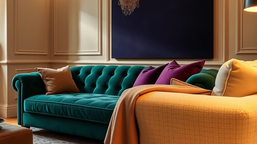
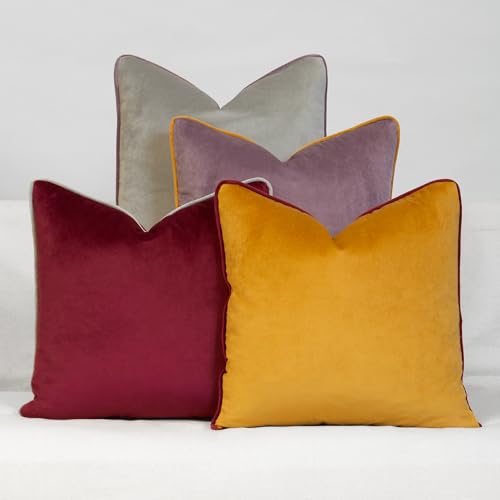
Mixing jewel tones with neutrals creates a sophisticated and vibrant color palette that instantly elevates any space or outfit. When you’re exploring how to balance boldness with subtlety, understanding effective color pairing becomes essential. Jewel tones—like emerald, sapphire, amethyst, and topaz—bring a sense of richness and depth. Neutrals such as beige, taupe, gray, or white serve as a calming backdrop that allows these vibrant hues to shine without overwhelming. Achieving design harmony means carefully selecting shades that complement each other, so your space or look feels cohesive rather than chaotic.
Mix jewel tones with neutrals for a balanced, sophisticated, and vibrant look that feels cohesive and elegant.
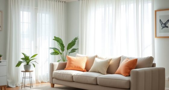
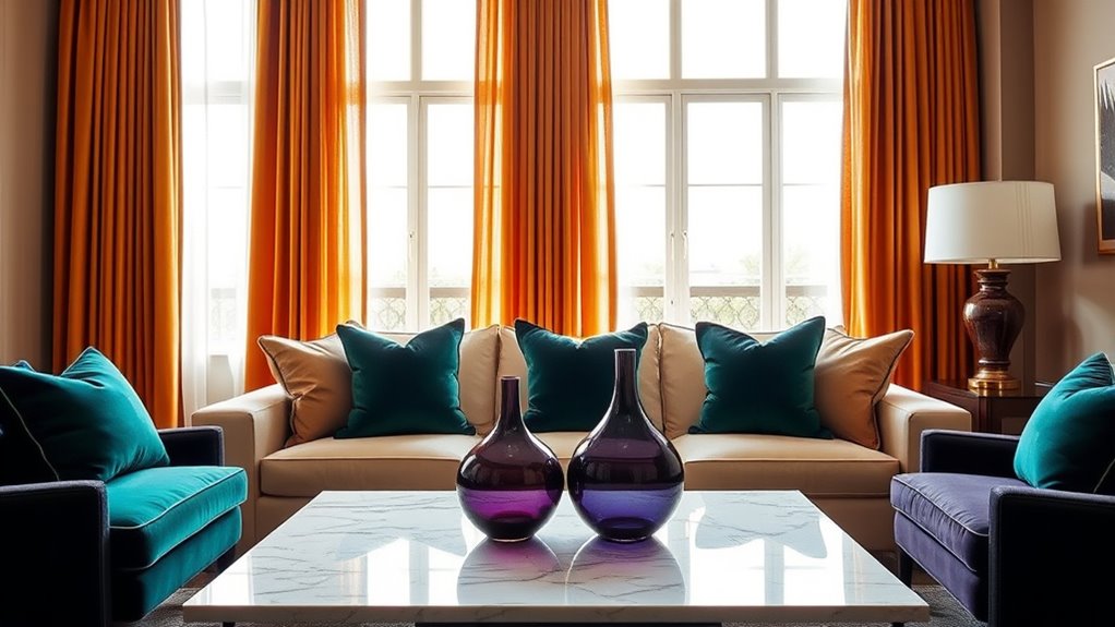
In your approach to color pairing, consider the intensity of the jewel tones against the neutrality you choose. For example, a deep sapphire paired with soft gray creates a striking yet balanced contrast that’s both eye-catching and tranquil. When you incorporate neutral elements, whether in furnishings, accessories, or clothing, you give your eye a resting place amid the more energetic hues. This balance prevents the space or outfit from feeling too busy or overwhelming. Think of neutrals as your foundation—they ground the bold tones and help you create a visual rhythm that’s pleasing to the eye.
To maintain design harmony, think about where and how you implement these colors. In interior design, you might opt for a neutral wall with accent pieces in jewel tones—like a velvet emerald sofa or sapphire throw pillows—adding richness without overpowering the room. For fashion, balance a neutral outfit with accessories in jewel tones, such as a sapphire necklace or amethyst earrings, adding pops of color that draw attention without dominating your look. When you combine these elements thoughtfully, the overall aesthetic feels deliberate, refined, and balanced.
Varying the proportion of jewel tones and neutrals is key. If your goal is to make a statement, go for a bold jewel-colored accent wall or a striking dress with subtle neutral accessories. Conversely, if tranquility is your aim, let neutrals dominate your palette with small touches of jewel tones as highlights. This strategic use of color pairing ensures your design remains harmonious, whether you seek to evoke excitement or serenity.
Ultimately, blending jewel tones with neutrals invites you to play with contrast and complementarity. When you pay attention to how these colors interact, you craft a space or outfit that radiates confidence and elegance. Incorporating color harmony principles helps you understand how these hues work together to create a unified, alluring look that’s both vibrant and peaceful.

OUYESSIR U-Shaped Sectional Sofa Couch, 4 Seat Sofa Set for Living Room, Convertible L-Shaped Velvet Couch Set with Chaise Lounge, Ottoman and Pillows,114 inches (Emerald Green)
【Emerald Green Sofa Set Includes】L shape emerald green u couch with chaise lounge + 1 Ottoman. The independent…
As an affiliate, we earn on qualifying purchases.
As an affiliate, we earn on qualifying purchases.
Frequently Asked Questions
How Can I Incorporate Jewel Tones Into a Minimalist Decor?
You can incorporate jewel tones into your minimalist decor by using color blocking with statement pieces like cushions or art in deep emerald or sapphire. Keep the surrounding neutrals simple to maintain tranquility, then add texture layering through plush rugs or velvet throws to create depth. This approach balances the drama of jewel tones with the calmness of neutrals, making your space both vibrant and serene.
What Are the Best Neutrals to Pair With Emerald Green?
You should pair emerald green with warm neutrals like beige, taupe, or soft greys for a balanced look. These neutrals create a calming backdrop, enhancing the jewel tone’s richness. Use complementary color schemes by adding subtle accents in gold or blush. Texture mixing, like plush fabrics or matte finishes, adds depth and interest, making your space both elegant and inviting without overwhelming the senses.
Can Mixing Jewel Tones Make a Small Space Look Cluttered?
Think of your small space as a delicate jewel, where too many colors can create visual clutter. Mixing jewel tones with bold color blocking might make your room feel cluttered if overdone. To avoid this, balance vibrant hues with neutral shades, giving your eyes a place to rest. Keep the palette cohesive, and you’ll maintain a sense of harmony, making your space feel larger and more inviting rather than chaotic.
How Do Lighting Choices Affect the Balance of Colors?
Lighting choices profoundly influence how colors appear and how well they balance in your space. Bright, natural light enhances the vividness of jewel tones, making them pop without overwhelming the room. Softer, warm lighting can create a tranquil ambiance, mellowing bold hues and neutrals alike. Remember, lighting effects directly impact color perception, so adjust your lighting to highlight the drama of jewel tones or promote calmness with neutrals, achieving the perfect balance.
Are There Seasonal Considerations When Combining These Colors?
Yes, seasonal considerations matter when combining jewel tones and neutrals. You’ll want to adapt your palette to seasonal color palettes for a cohesive look, like richer jewel tones in winter and softer neutrals in summer. Use holiday decorating tips to highlight your color choices, such as adding metallic accents for festive flair or incorporating natural textures for spring. This approach helps you create a balanced, seasonally appropriate space that feels both vibrant and tranquil.

JIAHANNHA Velvet Navy Blue Throw Pillow Covers 18×18 Inches Pack of 2 Soft Decorative Square Cushion Covers for Couch Sofa Bed Livingroom Car,45x45Cm
Size Color Material:Due to hand cutting, please allow 1 to 2 cm difference in size, which is normal.2PCS…
As an affiliate, we earn on qualifying purchases.
As an affiliate, we earn on qualifying purchases.
Conclusion
Think of your space as a symphony where jewel tones are the vibrant, daring solos and neutrals are the calming background harmony. When you balance these elements, you create a room that’s both lively and peaceful—a reflection of your unique spirit. Embrace the contrast, let each color speak its truth, and watch how your environment becomes a canvas of harmony. After all, your home is the stage where your personality shines brightest.

spot. Touch-Up Paint | Matte Finish for Cabinets, Walls, Doors & Furniture | Multi-Tone Gray Repair Kit | Quick-Dry, Self-Priming, Low-Odor, Eco-Friendly | No-Sanding or Primer Needed | 3 Pack
Includes Three Shades to Match 90% of Surfaces: We offer two color shades of Matte Gray and one…
As an affiliate, we earn on qualifying purchases.
As an affiliate, we earn on qualifying purchases.
Daisy Linens Decorative Throw Pillow Set of 4, 18" x 18" Solid Colorful Velvet Accent Pillow Covers, Jewel Tones
100% polyester, set of 4 pillow covers, with hidden zipper closure. Imported.
As an affiliate, we earn on qualifying purchases.
As an affiliate, we earn on qualifying purchases.