
To create a mood-boosting home, choose warm colors like yellow and orange to add happiness and energy. Balance these with cool shades like blue and green for calmness and relaxation. Use bright accents sparingly to energize your space without overwhelming it, and pair bold hues with neutrals for harmony. Proper palette coordination enhances positive feelings and makes your home feel inviting and uplifting. Keep exploring to discover how the right color schemes can transform your space.
Key Takeaways
- Use warm hues like yellow and orange to evoke happiness and optimism in your home.
- Incorporate cool shades such as blue and green for calming, relaxing spaces.
- Balance bold, bright colors with neutral backgrounds to create cheerful yet soothing environments.
- Apply color psychology principles to select hues that enhance mood and emotional well-being.
- Strategically use accent colors to energize rooms without overwhelming, maintaining harmony in your palette.
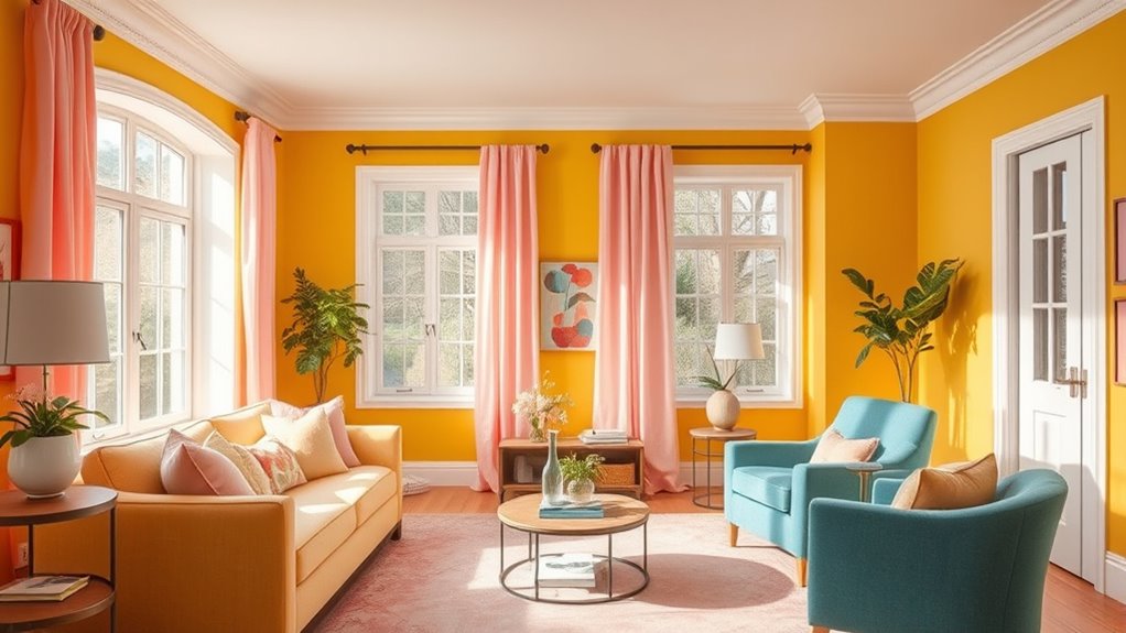
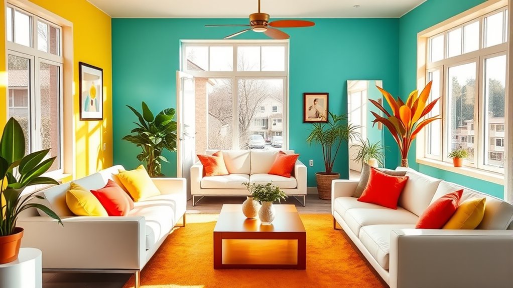
Have you ever wondered how some designs instantly catch your eye while others fall flat? It all comes down to how colors are used and combined. When you understand the principles of color psychology and palette coordination, you can create spaces that not only look good but also boost your mood. Colors have a powerful influence on your emotions and energy levels. For example, warm hues like yellow and orange are known to evoke happiness and optimism, making them perfect choices for areas where you want to feel uplifted. Conversely, cool shades like blue and green promote calmness and relaxation, ideal for bedrooms or quiet zones in your home.
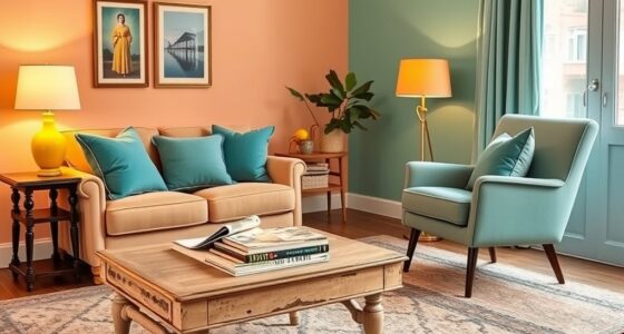
By mastering palette coordination, you ensure that your color choices harmonize well together, creating a cohesive and inviting environment. Think of palette coordination as the art of balancing different shades so they complement each other rather than clash. For mood-boosting colors, you want to select hues that work well together and reinforce the positive feelings you’re aiming for. For example, pairing a cheerful yellow with soft white or light gray can brighten a room without overwhelming it. Adding a touch of coral or turquoise as accent colors can further energize the space while maintaining harmony.
When choosing colors, consider how they interact with natural light and other elements in your room. Bright colors like lemon yellow or vibrant orange can make a small space feel lively and welcoming, but they can also be overwhelming if overused. To avoid this, use these bold shades as accents rather than the main color. Neutral backgrounds, such as beige or light taupe, allow bright colors to pop without feeling chaotic. This balance is key to creating an environment that feels both cheerful and calming. Additionally, understanding palette coordination helps you craft harmonious spaces that support your emotional well-being.
Frequently Asked Questions
How Do Different Lighting Conditions Affect Color Perception?
Different lighting conditions considerably impact how you perceive colors. Natural light, which varies throughout the day, can make colors look brighter and more vibrant, while artificial lighting, such as warm or cool bulbs, can alter their tone. You might notice colors appear different indoors versus outdoors or under different light sources. To guarantee your colors look just right, check them in both natural and artificial light before making final decisions.
Can Color Schemes Influence Productivity in Home Offices?
Imagine your workspace as a canvas—your choice of colors shapes your productivity. Color psychology shows that carefully selected hues can boost focus and motivation, making your home office more efficient. By organizing your workspace with mood-boosting colors, you create an environment that promotes clarity and energy. You have the power to influence your work habits simply by choosing colors that inspire and energize, transforming your space into a productivity hub.
Are There Culturally Specific Color Associations for Mood Enhancement?
You might wonder if cultural color symbolism affects mood. Yes, regional color preferences vary widely; for example, red symbolizes luck in China but danger in Western cultures. Understanding these cultural associations helps you choose colors that boost your mood authentically. When selecting paint, consider regional color preferences to create a space that feels welcoming and personally meaningful, reinforcing positive emotions tailored to your cultural background.
How Do I Balance Multiple Mood-Boosting Colors in One Room?
Imagine your room as a symphony of colors, each note contributing to harmony. To balance multiple mood-boosting colors, start with a neutral base that allows vibrant hues to shine without clashing. Use an accent color balance to highlight specific areas, ensuring no single shade overwhelms. Aim for color harmony by choosing shades that complement each other, creating a lively yet peaceful environment that elevates your mood effortlessly.
What Are the Best Colors for Bedrooms to Promote Relaxation?
For your bedroom, you wanna pick soothing shades that encourage relaxation. Opt for calming palettes like soft blues, gentle greens, or muted lavenders. These colors help lower stress and create a peaceful atmosphere. You should avoid overly bright or intense hues that might energize you instead of helping you unwind. By choosing these tranquil colors, you’ll craft a serene space perfect for restful sleep and relaxation.
Conclusion
Now that you know how colors can boost your mood, imagine the possibilities for your home. Which vibrant hue will you choose first? Will it transform your space into a sanctuary of happiness or a burst of energy? The choice is yours, and the results could surprise you. Ready to start painting your home happy? Don’t wait—your mood-boosting makeover is just a brushstroke away. Are you prepared to discover the secret color that could change everything?