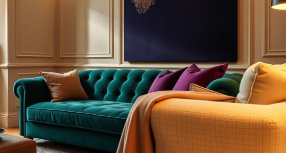

In 2025, muddy colors like complex pinks, purples, greens, and yellows will define sophisticated aesthetics. These hues feature layered tones and subtle gradations, creating depth and richness in your artwork. They draw inspiration from cultural influences and natural dyes, offering emotional resonance and timeless appeal. By experimenting with blending and layering, you can craft versatile pieces that invite closer inspection. Keep exploring to discover how these nuanced shades can transform your creative approach.
Key Takeaways
- Muddy colors in 2025 feature complex, layered hues of pinks, purples, greens, and yellows that emphasize depth and nuance.
- These colors are created through sophisticated mixing techniques, blending muted tones, and subtle gradations.
- Cultural influences from East Asian, Mediterranean, and natural dye traditions shape the rich palettes.
- Muddy hues serve as versatile elements, functioning as neutral backdrops or focal points in artwork.
- They encourage experimental layering, fostering a contemporary yet historically resonant aesthetic.
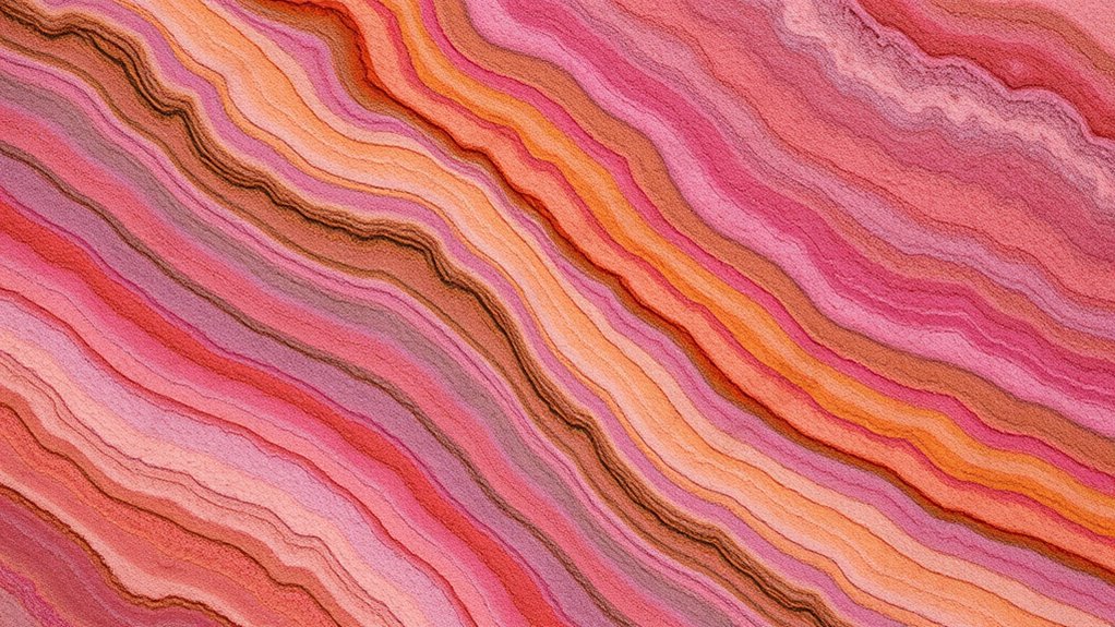
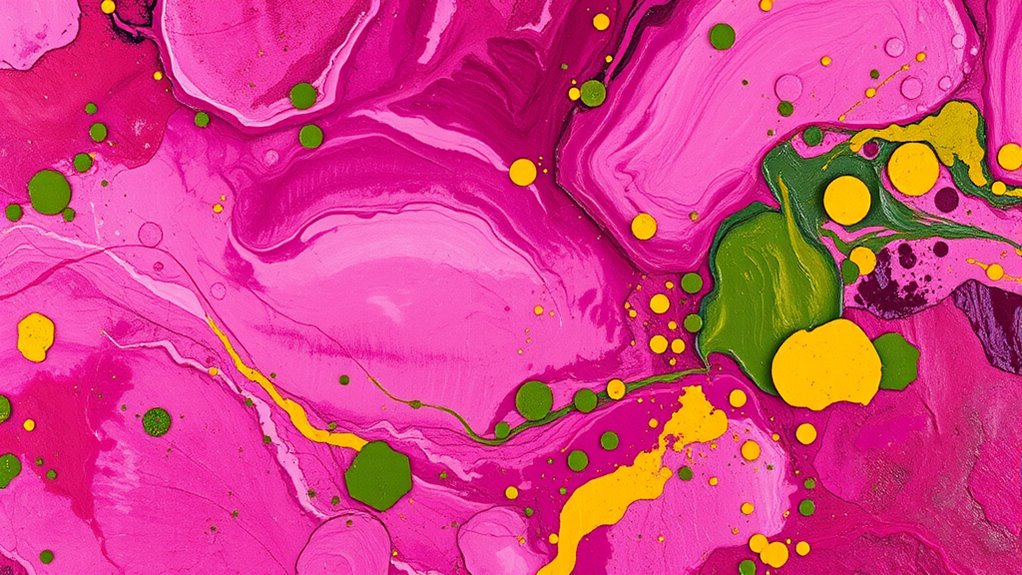
As we look ahead to 2025, muddy colors are set to become a defining trend in design and art, offering a sophisticated alternative to bright, bold palettes. These complex hues—pinks, purples, greens, and yellows—bring a richness and depth that invite closer inspection. To achieve these nuanced shades, you’ll want to master specific color mixing techniques. Instead of relying on straightforward, primary mixes, you’ll combine muted tones and subtle gradations. For instance, blending a soft pink with a touch of gray or beige creates a muted, sophisticated pink that feels both modern and timeless. Similarly, mixing a vibrant purple with earthy browns or olive greens can produce a complex, layered hue. The key lies in understanding how to balance saturation and opacity, gradually building depth through layering and blending. This approach allows you to create muddy colors that aren’t dull or flat but vibrant in their subtlety. Mastering color layering techniques will further enhance your ability to craft these rich, complex hues with depth and nuance.
Cultural influences play a significant role in shaping these muddy colors, adding context and meaning to your palette choices. Different regions and traditions have long valued muted, earthy tones, often linked to natural dyes, historical palettes, and cultural symbolism. For example, in East Asian art, subdued pigments derived from natural sources evoke serenity and harmony, inspiring contemporary artists to incorporate similar palettes into their work. In Mediterranean cultures, weathered terracotta and faded frescoes influence color choices that emphasize aging and history. You might find that integrating these cultural influences helps you create colors that resonate on a deeper level, adding storytelling and cultural depth to your art. When selecting colors, think about the stories behind the hues—how they relate to history, geography, and tradition—and let those stories inform your mixing techniques.
The beauty of muddy colors lies in their versatility and subtlety. They’re not just muted versions of bright colors but complex, layered tones that evoke emotion and sophistication. By understanding color mixing techniques and drawing inspiration from diverse cultural influences, you set yourself up to create artworks that feel both contemporary and rich in history. These shades can act as a neutral backdrop or serve as focal points, depending on how you layer and combine them. As you experiment, remember that muddy colors thrive on nuance and depth. They invite viewers in for a closer look, revealing more with each glance. In 2025, expect muddy hues to challenge your perception of color, encouraging a more thoughtful, layered approach to your creative process.
Frequently Asked Questions
How Do Muddy Colors Influence Modern Art Aesthetics?
Muddy colors influence modern art aesthetics by creating rich, nuanced color harmony that draws viewers in. You can use these complex shades to evoke deep emotional expression, adding authenticity and subtlety to your work. By blending pinks, purples, greens, and yellows, you craft layers of meaning and mood, encouraging viewers to explore the emotional depth behind your art while maintaining a sophisticated, contemporary look.
What Are the Best Materials for Creating Complex Muddy Hues?
To create complex muddy hues, you should focus on natural pigment mixtures like earth tones, oxides, and organic dyes. Use layering techniques to build depth and richness, blending multiple colors gradually to achieve subtle shift. Experiment with combinations like raw sienna, burnt umber, and ultramarine to develop nuanced pinks, purples, greens, and yellows. These materials and methods give you control over the earthy, complex qualities that define muddy colors.
Can Muddy Colors Be Used Effectively in Digital Painting?
Yes, muddy colors can be used effectively in digital painting. You just need to master color mixing strategies and digital palette management. By blending muted tones thoughtfully, you can create depth and complexity in your work. Use layers and adjust opacity to control muddy hues, ensuring they add richness without overwhelming your piece. This approach helps you achieve sophisticated, nuanced colors that enhance your overall composition.
How Do Cultural Trends Shape Color Preferences for 2025?
You’ll find that cultural trends considerably influence color preferences for 2025. Cultural symbolism shapes which hues resonate emotionally, while fashion influence introduces fresh palettes inspired by current styles. By staying aware of these trends, you can choose colors that feel relevant and meaningful, blending symbolism and fashion to create artwork that connects deeply with viewers and reflects the evolving cultural landscape.
What Psychological Effects Do Complex Muddy Colors Have on Viewers?
You’ll find that complex muddy colors evoke emotional depth, creating a sense of mystery and introspection. These hues can engage viewers on a deeper level, prompting reflection and curiosity. Their subtle, layered tones invite prolonged engagement, encouraging viewers to explore the nuances and textures. As a result, these colors foster emotional connection, making your work more enthralling and memorable by resonating on a psychological level.
Conclusion
As you explore these muddy hues for 2025, remember that beauty often lies in subtlety and imperfection. Embrace the quiet complexity they bring, allowing your work to whisper stories beneath their muted tones. Sometimes, the most understated colors hint at deeper emotions, inviting others to look closer. Trust in this delicate balance—your palette’s richness may just reveal more than you initially see, reminding you that true artistry often thrives in the nuanced and imperfect.