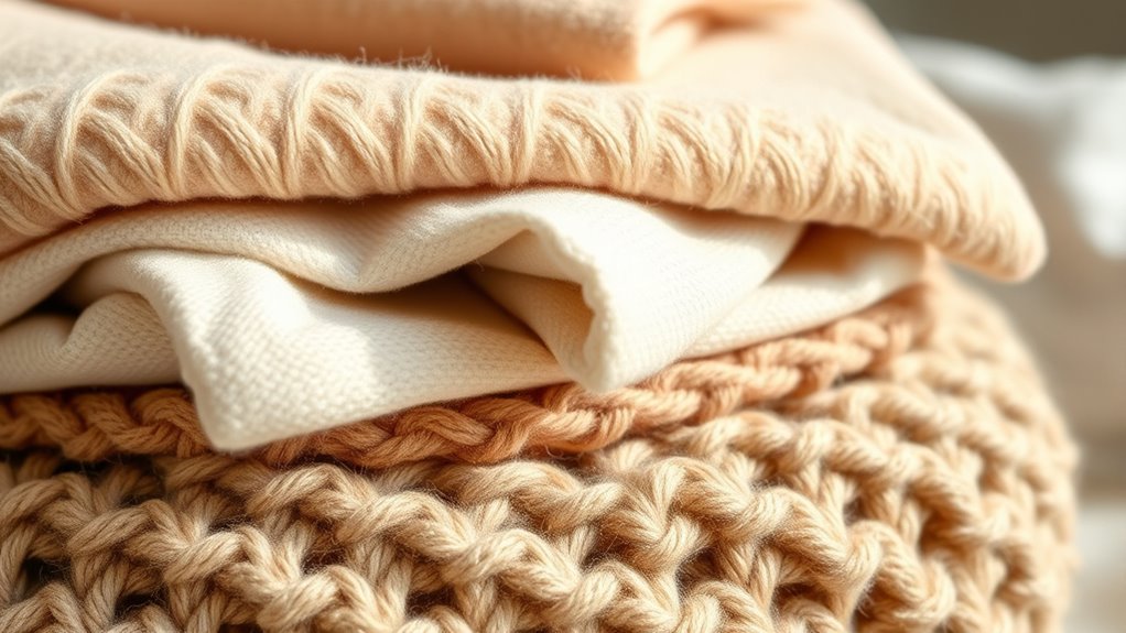

Using beige, cream, and oatmeal as your neutral foundation creates a timeless, sophisticated backdrop that grounds your entire palette. These shades are versatile and adaptable, effortlessly balancing brighter or bolder colors while adding warmth and stability to your space. They carry minimal cultural baggage, making them safe choices that evoke calm and order. To discover how to craft cohesive designs with these neutrals and more tips, keep exploring the endless possibilities they offer.
Key Takeaways
- Beige, cream, and oatmeal serve as versatile neutral bases that create a calm, stable foundation for diverse interior palettes.
- These tones enhance the timeless and sophisticated feel of a space, reflecting historical significance and cultural symbolism.
- Using neutral hues allows brighter or more vibrant colors to stand out, adding visual interest without clutter.
- Neutral foundations support harmonious design by providing contrast and balance, emphasizing balance and cohesion.
- Incorporating these shades signals order and tranquility, grounding your palette for a cohesive, refined environment.
Have you ever wondered what truly underpins a stable and fair society? It’s often the subtle, foundational elements that provide a sense of balance and trust. Similarly, in design, the use of neutral tones like beige, cream, and oatmeal acts as a grounding force, creating a calm and cohesive environment. These hues are more than just safe choices; they carry a deep historical significance rooted in tradition and cultural symbolism. For centuries, neutral colors have been used to denote purity, sophistication, and stability. In ancient civilizations, like Egypt and Rome, creamy and earthy tones were associated with wealth and power, symbolizing durability and permanence. By understanding this background, you can appreciate how color pairing with these shades communicates subtle messages and influences mood.
When you incorporate beige, cream, or oatmeal into your palette, you’re engaging in a visual language that’s timeless and versatile. These shades work as a backdrop, allowing brighter or more vibrant colors to pop without overwhelming the senses. They also serve as a bridge, helping various hues coexist harmoniously. For instance, pairing a soft beige with a muted sage green creates a serene, natural vibe, while combining oatmeal with charcoal offers a modern, sophisticated look. The beauty of these neutrals lies in their adaptability—they can be styled to evoke warmth, elegance, or minimalism, depending on your goals.
Color pairing with neutral tones isn’t accidental; it’s rooted in a long-standing tradition of balance and harmony. Historically, neutrals have been used to highlight other colors, providing contrast without distraction. Think of classic interiors or fashion where cream-colored walls set off rich jewel-toned furnishings or accessories. The timelessness of these shades means they carry minimal cultural baggage, making them safe yet powerful choices for any setting. Their understated nature also signals a sense of calm and order, reinforcing the idea that stability is built on simple, enduring foundations. Incorporating antique pieces that feature these neutral hues can further enhance the sense of history and authenticity in your design.

Eiayeebil Dual Motor Power Lift Recliner Chairs with Heat and Massage for Elderly, Leather Electric Recliners with Footrest, Infinite Position Lift Chair with Cupholder,USB & Type C Ports(Brown)
DUAL MOTOR LIFT ASSISTANCE: Enjoy ultimate comfort with dual motors that independently control the backrest and footrest. Adjust...
As an affiliate, we earn on qualifying purchases.
Frequently Asked Questions
How Do I Incorporate Beige Into a Colorful Room?
You can incorporate beige into a colorful room by using it as an accent color through layered neutral decor. Add beige throw pillows, rugs, or curtains to balance vibrant hues without overwhelming the space. Layer different shades of beige with other neutrals to create depth and warmth. This approach grounds your room, making bold colors pop while maintaining a cohesive, inviting atmosphere.
What Are the Best Complementary Colors for Oatmeal?
Did you know that oatmeal pairs beautifully with blue, green, or plum? These colors follow the rule of color wheel harmony, creating calming, balanced neutral color pairings. To complement oatmeal, choose soft blues for serenity, muted greens for freshness, or deep plums for richness. These combinations add depth and interest without overwhelming your space, making your room feel inviting while maintaining a sophisticated, harmonious look.
How Can I Prevent Neutrals From Feeling Dull?
To prevent neutrals from feeling dull, play with color saturation by adding pops of vibrant or muted hues to create visual interest. Incorporate texture contrast with woven, matte, or glossy finishes to add depth and dimension. You can also layer different shades of neutrals or introduce subtle patterns. These techniques keep your space lively and dynamic, ensuring neutrals serve as a versatile yet engaging backdrop.
Are There Eco-Friendly Options for Beige Paints?
Yes, you can find eco paint options for beige that are sustainable and environmentally friendly. Look for brands that prioritize low VOC, natural ingredients, and eco certifications to guarantee you’re choosing sustainable beige shades. These options reduce harm to the environment and indoor air quality, giving you a beautiful neutral palette that’s both stylish and eco-conscious. Always check labels for eco-friendly credentials to make the most responsible choice.
How Do Neutrals Affect Room Lighting and Ambiance?
Neutrals like beige, cream, and oatmeal influence your room’s lighting and ambiance by enhancing natural light effects, making spaces feel brighter and more open. They reflect light softly, creating a warm, inviting atmosphere. These shades also support mood enhancement, promoting calmness and relaxation. By choosing neutrals, you enable your room to feel cozy and spacious simultaneously, perfectly balancing light and ambiance for a comfortable, welcoming environment.

MCombo Dual Motor Power Lift Recliner Chair with Massage and Heat for Elderly People, Infinite Position, USB Ports, Cup Holders, Fabric 7890 (Medium, Mocha)
Why Dual Motor. With the dual motor design, the dual motor lift chair's backrest and footrest can be...
As an affiliate, we earn on qualifying purchases.
Conclusion
So, who knew that beige, cream, and oatmeal could actually make your space feel grounded and stylish? Turns out, sticking to neutrals isn’t just safe—it’s secretly daring. After all, in a world obsessed with bold colors, choosing subtle tones is your quiet rebellion. So go ahead, embrace these understated shades. Who needs flashy when you can have timeless? Sometimes, the simplest choices make the biggest statement—without even trying.

MCombo Dual Motor Small Power Lift Recliner Chair for Elderly, Lay Flat Lift Chair with Heat and Massage, Petite Lift Chair, Cup Holders, Faux Leather 7893 (Cream White, Small)
DUAL MOTOR. With the help of built-in dual motor, the chair's backrest and footrest work independently, it means...
As an affiliate, we earn on qualifying purchases.

Lynkron Power Lift Recliner Chair for Elderly, Oversized Leather Lift Chair with Heat and Massage, Dual Motor Zero Gravity Power Recliner Chair with Adjustable Headrest, Cup Holder & USB Port
【Dual-Motor Lift & Stand Assist 】 Dual independent motors adjust back and footrest separately; manual adjustable headrest supports...
As an affiliate, we earn on qualifying purchases.