
To revive vintage designs with a modern twist, focus on bold color schemes that blend nostalgia and contemporary style. Use complementary contrasts, like teal and coral, to make your visuals pop, or opt for monochromatic palettes with shades and tints to add depth and sophistication. Combining these techniques helps create vibrant yet cohesive retro aesthetics that stand out. If you want to explore how these color strategies can elevate your projects, there’s more to discover ahead.
Key Takeaways
- Vintage color palettes often incorporate bold complementary contrasts for energetic, eye-catching retro designs.
- Monochromatic schemes provide elegant, cohesive vintage looks with depth and subtle sophistication.
- Combining contrasting and monochromatic techniques creates versatile, modern retro color palettes.
- Retro revival trends favor nostalgic hues like teal, coral, purple, and yellow for authentic vintage appeal.
- Thoughtful color pairing enhances vintage elements, evoking nostalgia while maintaining contemporary relevance.

Color schemes are essential tools for creating visually appealing and harmonious designs. When you choose the right palette, you can evoke specific emotions, guide the viewer’s eye, and establish a cohesive aesthetic. Among the most effective techniques are complementary contrasts and monochromatic harmony. These strategies help you balance boldness with subtlety, making your vintage-inspired projects stand out while maintaining a sense of unity.
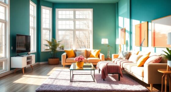
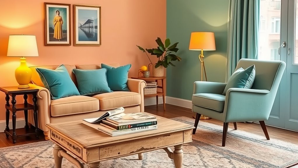
Complementary contrasts involve pairing colors that sit opposite each other on the color wheel. This approach creates vibrant, eye-catching combinations that immediately draw attention. For a retro revival theme, think of pairing a rich teal with warm coral or a deep purple with bright yellow. These contrasts make your vintage palettes pop, emphasizing key design elements and adding energy to your work. When done well, complementary contrasts can evoke a sense of nostalgia while keeping your design fresh and engaging. The trick is to use these contrasting colors thoughtfully—perhaps limiting them to accents or specific areas—so they don’t overwhelm the overall look. This technique works especially well when you want to highlight vintage typography, icons, or decorative elements, giving your design a lively, dynamic feel that recalls the bold color choices of past eras.
Pair opposite colors thoughtfully to create vibrant, nostalgic vintage designs with energy and balance.
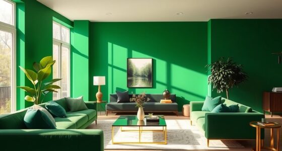
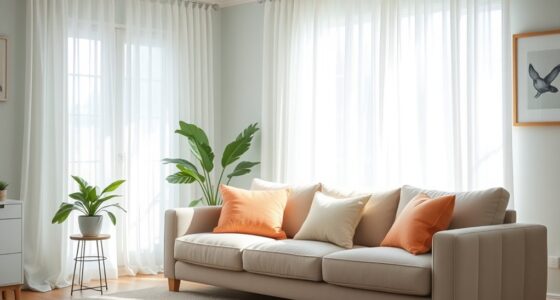
On the other hand, monochromatic harmony relies on variations within a single hue, creating a more subtle and sophisticated vintage aesthetic. This approach involves selecting one primary color and exploring its different shades, tints, and tones. For instance, a palette of blues ranging from pale sky to deep navy can evoke a cool, calming retro vibe. Monochromatic schemes are perfect if you want a cohesive, polished look that’s easy on the eyes yet rich in depth. They also provide a versatile foundation for adding vintage textures or patterns without clashing. When you use monochromatic harmony, you can subtly shift the mood from vibrant and energetic to elegant and understated, depending on your chosen hue and the variations you incorporate. Additionally, understanding color psychology can help you select hues that effectively convey the desired vintage emotion or theme.
Both complementary contrasts and monochromatic harmony serve different purposes but share the ability to make vintage color palettes resonate with modern audiences. By mixing these techniques, you can craft designs that are both eye-catching and harmonious. Whether you want to create a bold, retro statement with striking contrasts or a more refined, nostalgic feel with monochromatic tones, understanding how to leverage these color schemes will help you revive vintage aesthetics with a contemporary twist. You’ll find that mastering these strategies allows you to evoke the charm and character of past eras while keeping your design fresh and relevant.
Frequently Asked Questions
How Do I Choose Retro Colors for Modern Designs?
When choosing retro colors for modern designs, consider color psychology to evoke the right emotions and cultural influences to guarantee relevance. Look for authentic vintage palettes that resonate with your target audience, blending bold hues with softer shades. Use these colors thoughtfully to enhance your design’s message, balancing nostalgia with contemporary appeal. Stay inspired by classic trends but adapt them creatively to fit your unique style and modern context.
Which Vintage Palettes Are Trending Right Now?
You’ll notice that famous vintage color combinations like teal and coral or mustard yellow and deep navy are trending now. These nostalgic color usages evoke a retro vibe that’s both fresh and familiar. To stay on trend, incorporate these palettes into your modern designs, blending classic charm with contemporary style. Whether for branding or interior decor, using vintage palettes adds a unique, timeless touch that resonates with today’s audience.
Can Retro Colors Suit Corporate Branding?
Imagine a tech startup using retro-inspired teal and orange. Retro colors can suit corporate branding when you consider color psychology and cultural associations. These shades evoke creativity and innovation, making them appealing for brands wanting to stand out. By choosing vintage palettes thoughtfully, you align your brand’s personality with positive emotions, creating memorable impressions that resonate with your audience, all while embracing a stylish, nostalgic vibe.
How Do I Balance Multiple Vintage Hues?
When balancing multiple vintage hues, you focus on color harmony to create a cohesive look. Start with complementary or analogous vintage color combinations to guarantee they work well together. Use neutral tones to ground your palette, allowing the retro hues to stand out without clashing. By carefully choosing and blending these vintage colors, you’ll achieve a harmonious and visually appealing design that highlights your retro aesthetic effectively.
Are Retro Color Schemes Suitable for Digital Media?
You can definitely use retro color schemes in digital media, but consider color psychology and cultural symbolism. Bright, nostalgic hues evoke specific emotions and memories, helping you connect with your audience. Use vintage palettes thoughtfully to enhance branding or storytelling. Just make sure the colors align with your message and audience’s cultural context. When done right, retro schemes can make your digital content stand out and feel both fresh and familiar.
Conclusion
So, there you have it—your crash course in vintage hues making a glorious comeback. Who knew that dusty rose and avocado green could still turn heads? Now’s your chance to embrace the retro revival, because why settle for boring when you can splash your world with a dash of nostalgia? Go ahead, ditch the dull, and let these vintage palettes add a splash of fun—before everyone else catches on and ruins the charm.