
Balancing bold hues with natural elements is all about harmony. Use earthy tones like browns, greens, and blues as a grounding backdrop, then add vibrant accents carefully to keep the calm vibe. Mix textures by pairing matte walls with glossy finishes or rough stone with sleek glass to create visual interest. Strategic contrast helps highlight features without overwhelming. Staying mindful of color, texture, and balance keeps your space lively yet soothing—exploring more will help you master this art even further.
Key Takeaways
- Use earthy, natural colors as a neutral backdrop to incorporate bold hues without overwhelming the space.
- Balance bold colors with textured surfaces like stone or wood to create visual interest and tactile harmony.
- Combine matte natural tones with glossy or shiny accents to enhance contrast and depth.
- Introduce bold hues sparingly, ensuring they complement rather than disrupt the calming natural palette.
- Strategically pair contrasting textures—such as rough stone with smooth ceramics—to maintain a balanced, dynamic environment.
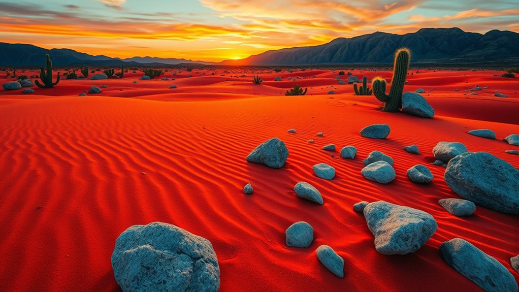
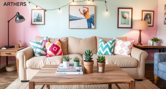
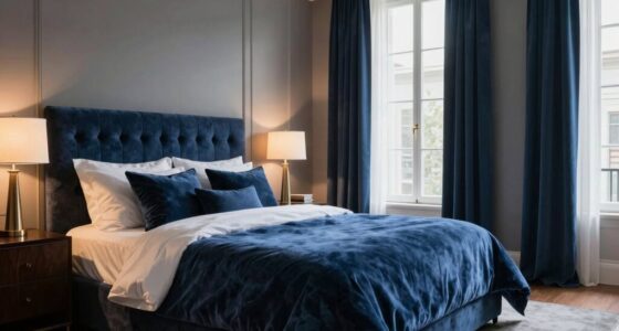
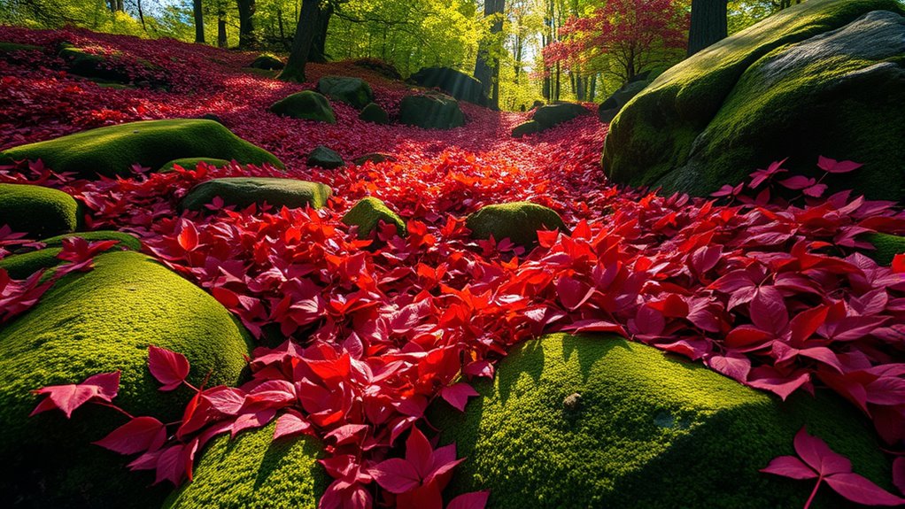
Achieving harmony in design often hinges on balancing color and texture, as these elements work together to create visual interest and cohesion. When you incorporate nature-inspired palettes, you bring a calming, organic quality to your space that resonates deeply with natural surroundings. Think of earthy tones like warm browns, soft greens, and gentle blues, which evoke the serenity of forests, lakes, and mountains. These colors serve as a grounding foundation, allowing you to experiment with bold hues without overwhelming the senses. By pairing striking reds or vibrant yellows with muted, natural shades, you create a dynamic yet balanced environment that feels lively but rooted in tranquility. The key is to let the natural palette act as a backdrop, so your bold colors stand out without clashing.
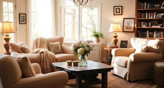
Contrasting surface finishes also play a fundamental role in establishing this balance. Imagine pairing matte walls with glossy accents or rough stone textures with sleek glass surfaces. These contrasting finishes heighten the tactile experience and add depth to your space. For example, a matte, earthy-colored wall contrasted with shiny metallic fixtures highlights both the natural inspiration and modern flair. Similarly, combining textured wood panels with smooth, polished ceramic tiles creates a layered look that invites touch and visual exploration. The mix of textures not only enhances aesthetic appeal but also emphasizes the inherent qualities of each element, making your design more engaging and full of character. Incorporating texture variety can further enhance the tactile richness of your space, creating a more inviting atmosphere. When you thoughtfully select contrasting surface finishes, you’re effectively creating focal points and visual interest that guide the eye throughout the room.
In practice, integrating these elements requires a keen eye for proportion and harmony. Use natural-inspired colors as a unifying theme, then add bold hues carefully to prevent overpowering the space. Balance is essential; too much contrast or overly vibrant colors can disrupt the intended tranquility. Instead, introduce contrasting surface finishes strategically—perhaps with a textured stone fireplace against smooth painted walls or matte cabinetry paired with glossy countertops. This approach ensures your design feels cohesive rather than chaotic. As you combine bold colors with natural palettes and contrasting finishes, you craft an environment that is both stimulating and soothing. The result is a space that invites you to relax, reflect, and appreciate the thoughtful interplay of color and texture—an environment perfectly tuned to your personal style and the natural world around you.
EVOLVE Paint & Primer: Environment-friendly, Low Sheen with One-coat Coverage for Interior & Exterior surfaces (Burlap Brown, 1-Gallon)
PAINT + PRIMER IN ONE: Evolve’s paint-and-primer formula helps you get great coverage from the start, sealing your…
As an affiliate, we earn on qualifying purchases.
As an affiliate, we earn on qualifying purchases.
Frequently Asked Questions
How Can I Incorporate Bold Colors Without Overwhelming a Space?
You can incorporate bold colors without overwhelming a space by applying color theory principles, like using accent walls or accessories to add pops of vibrant hues. Balance these with natural elements and texture contrast, such as neutral furniture or soft textiles, to create harmony. Keep the bold colors limited to specific areas, allowing them to stand out without dominating the entire room. This approach keeps your space lively yet balanced.
What Natural Textures Complement Bold Hues Effectively?
Oh, sure, because nothing screams sophistication like mixing neon pink with a burlap throw—said no one ever. But if you want to keep it classy, try earthy textiles like linen or jute, which soften bold hues. Pair them with rough wood finishes to add texture and balance. This combo creates a grounded, natural vibe that keeps your space vibrant yet inviting—no need for a color clash catastrophe.
Are There Specific Color Combinations Best for Small Rooms?
For small rooms, stick to light, neutral shades like soft blues, warm beiges, or pale grays to create a sense of space. Use bold accents sparingly to add personality, ensuring color psychology supports a calming environment. Focus on maintaining visual harmony by balancing these hues with natural textures like wood or linen. This approach makes your space feel larger, inviting, and well-coordinated without overwhelming the senses.
How Do Lighting Conditions Affect Color and Texture Choices?
Lighting can dramatically change your space’s vibe. When natural daylight pours in, it enhances vibrant hues and highlights textures, making bold colors pop. Artificial lighting, however, can cast shadows or dull tones, so choose warm or cool bulbs carefully. You might find that a room’s mood shifts throughout the day, revealing new depths in your textures and colors—so plan your lighting to complement both natural and artificial sources for the perfect balance.
Can This Design Approach Suit Both Modern and Traditional Interiors?
Yes, this design approach suits both modern and traditional interiors. You can blend bold hues and natural elements by respecting historical context and cultural influences, creating a harmonious balance. In modern spaces, it adds vibrancy and texture, while in traditional settings, it enhances richness and authenticity. By thoughtfully integrating these elements, you make your space feel both current and timeless, reflecting your unique style and cultural appreciation.

Creative Hobbies 12 Pack of Glossy White Glazed Ceramic Tiles for Alcohol Ink Painting, Decorating, Arts & Crafts, 4.25 x 4.25 Inch Square, Ready-to-Paint Ceramics
🎨 VALUE PACK: 12 high-quality glossy white ceramic bisque tiles, perfect for a variety of decorating techniques including…
As an affiliate, we earn on qualifying purchases.
As an affiliate, we earn on qualifying purchases.
Conclusion
By blending bold colors with natural textures, you create spaces that feel vibrant yet grounded. Did you know that homes using a mix of vivid hues and natural materials report 30% higher satisfaction? When you balance striking shades with organic elements, you craft a dynamic environment that energizes and comforts simultaneously. So, don’t shy away from experimenting—your perfect harmony of color and texture is within reach, transforming your space into a lively, welcoming sanctuary.

Art3d 4-Piece Wood Slat Acoustic Panels for Stylish Decor and Noise Reduction, 3D Textured Panel for Ceiling and Wall, Oak
Superior Acoustic Performance: It is designed to provide excellent noise-cancellation capabilities, making it ideal for use in homes,…
As an affiliate, we earn on qualifying purchases.
As an affiliate, we earn on qualifying purchases.
Rust-Oleum 287722 Chalked Ultra Matte Interior Paint, 30 oz, Matte Clear Topcoat
Use on a variety of interior surfaces like wood, metal, ceramic, canvas and easily distress to create a…
As an affiliate, we earn on qualifying purchases.
As an affiliate, we earn on qualifying purchases.