
To incorporate 2025’s Color of the Year into your home, start with a monochromatic scheme by varying shades for walls, furniture, and accents to create a cohesive look. Use complementary colors sparingly for contrast, adding pops of lively accents through accessories or artwork. Balance bold hues with neutral or subdued backgrounds to maintain harmony. If you keep these tips in mind, you’ll discover practical ways to elevate your space effortlessly.
Key Takeaways
- Incorporate 2025’s Color of the Year as a dominant hue in walls or large furniture for a fresh, modern look.
- Use monochromatic shades of the year’s color for a cohesive and calming space.
- Pair the color with complementary shades for vibrant accents and visual contrast.
- Vary textures and finishes of the color to add depth and interest to your decor.
- Balance bold color use with neutral or subdued elements to prevent overwhelming the space.
Color schemes are essential for creating visually appealing and harmonious designs. They set the mood, define style, and influence how you feel in a space. When choosing a color scheme for your home, consider how different colors work together to create balance and interest. Two popular strategies are using complementary palettes and incorporating monochromatic accents. These approaches can help you craft a space that feels lively yet cohesive.
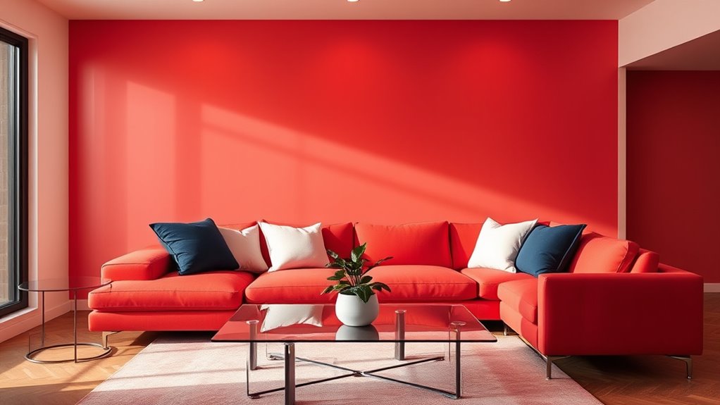
Complementary palettes involve pairing colors that sit opposite each other on the color wheel. Think of vibrant blue and warm orange, or rich purple and bright yellow. These combinations create striking contrasts that energize a room. If you’re aiming for a bold, dynamic look, start with a dominant color and add its complement as an accent. For instance, if you choose a calming teal as your main color, introduce coral or burnt orange in small doses—like throw pillows or artwork—to add vibrancy without overwhelming the senses. Complementary palettes work well in spaces where you want a spirited, lively atmosphere, but be careful not to overdo it. Balance is key, so keep large areas neutral or subdued and let the contrasting colors serve as highlights.
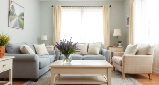
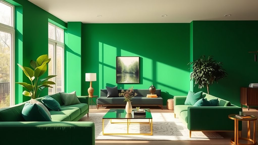
Monochromatic accents, on the other hand, involve varying shades, tints, and tones of a single color. This approach creates a sophisticated, unified look that feels calm and refined. If you decide to use the color of the year for 2025, for example, you could select different shades of that hue—lighter for walls, darker for furniture, and subtle accents in between. Incorporating monochromatic accents is a smart way to add depth and interest without cluttering the visual field. It allows you to experiment with texture and material, such as matte versus glossy finishes, which enhances the overall richness of the space. Using color harmony principles can help ensure the chosen shades work seamlessly together. Monochromatic schemes are especially effective in small rooms, making them appear larger and more cohesive. Plus, they provide a versatile backdrop that makes decorating easier, since you can add pops of contrast with accessories or artwork.

Chroma Mural Paint, Assorted Primary Colors, Pints, Set of 6
Mural paint offers lasting results on both outdoor and indoor murals, canvas, and other mediums
As an affiliate, we earn on qualifying purchases.
As an affiliate, we earn on qualifying purchases.
Frequently Asked Questions
How Can I Incorporate the Color of the Year Into Small Spaces?
To incorporate the color of the year into small spaces, consider space-saving tips like using it on accent walls to add visual interest without overwhelming the room. You can also introduce the color through accessories, such as throw pillows or artwork, to keep the space feeling open. Focus on accent wall ideas that highlight the color, making your small room feel more vibrant and stylish without cluttering it.
Are There Any Color Combinations to Avoid With This Year’s Hue?
Imagine your walls glowing with the year’s hue, but avoid complementary contrasts that clash like oil and water. Steer clear of clashing patterns that fight for attention, creating visual chaos instead of harmony. You want your space to feel balanced, so pair this color with soft neutrals or analogous shades. Stay mindful of bold contrasts, as they can overwhelm small areas, making them feel chaotic rather than cozy.
What Textures Complement the 2025 Color of the Year?
When considering texture pairing with this year’s color of the year, think about balancing smooth and rough surfaces. Soft fabrics like velvet or plush rugs contrast beautifully with matte or textured wall finishes. Material choices like natural wood, woven textiles, and ceramics add depth. Use these textures to create visual interest and harmony, ensuring your space feels inviting and well-coordinated with the color’s vibe.
Can This Color Be Used Effectively in Different Interior Design Styles?
You can definitely use this color effectively across various interior design styles. Its versatility stems from its color psychology, creating calm or energizing atmospheres depending on how you incorporate it. Consider cultural significance for meaningful accents. Whether you prefer modern, traditional, or eclectic looks, this hue adapts well, adding personality and balance. Play with different textures and accessories to highlight its unique qualities in your space.
How Do I Choose the Right Shade of This Year’s Color for My Home?
When choosing the right shade for your home, focus on shade matching and paint selection. Consider how the color complements your existing decor and lighting. Test small swatches in different areas to see how they look at various times of day. Opt for a shade that reflects your personality and enhances your space. Don’t rush—taking time to select the perfect hue guarantees a cohesive, beautiful result.

HIG Set of 2 Decorative Round Pleated Throw Pillows, Classy Accent Pumpkin Throw Pillows with Center Button, Vintage Velvet Floor Pillows for Sofa Vanity Chair Bed, Rust, 14.5" Diameter(Ripple)
EXQUISTIE HANDCRAFTED PLEATED DESIGN: This decorative round pillow with unique pumpkin shape is soft to the touch and…
As an affiliate, we earn on qualifying purchases.
As an affiliate, we earn on qualifying purchases.
Conclusion
Get ready to turn your home into the ultimate masterpiece with 2025’s color of the year! When you embrace this hue, you’ll feel like you’ve discovered the secret to making every room look instantly chic and jaw-droppingly stunning. It’s not just a color—it’s a game-changer that transforms your space from boring to breathtaking in seconds. So go ahead, splash this shade around, and watch your home become the envy of everyone you know!

Magicfly 15 Pcs Chalk Furniture Paint Set, 9 Colors Ultra Matte Finish Acrylic Craft Paint Set (60 ml/2 oz) with 1 Liquid Wax, 2 Brushes, 3 Sandpapers, Perfect for Home Decor, Crafts-Farmhouse
【Perfect Color Combination】Magicfly chalk paint set includes 9 colors in 2 oz bottles. The farmhouse colors are soft…
As an affiliate, we earn on qualifying purchases.
As an affiliate, we earn on qualifying purchases.
Krylon K18213 Coarse Stone Texture Finish Spray Paint, White Onyx, 12 Ounce
Multicolor Solids To Create A Rich Finish That Accents Accessories
As an affiliate, we earn on qualifying purchases.
As an affiliate, we earn on qualifying purchases.