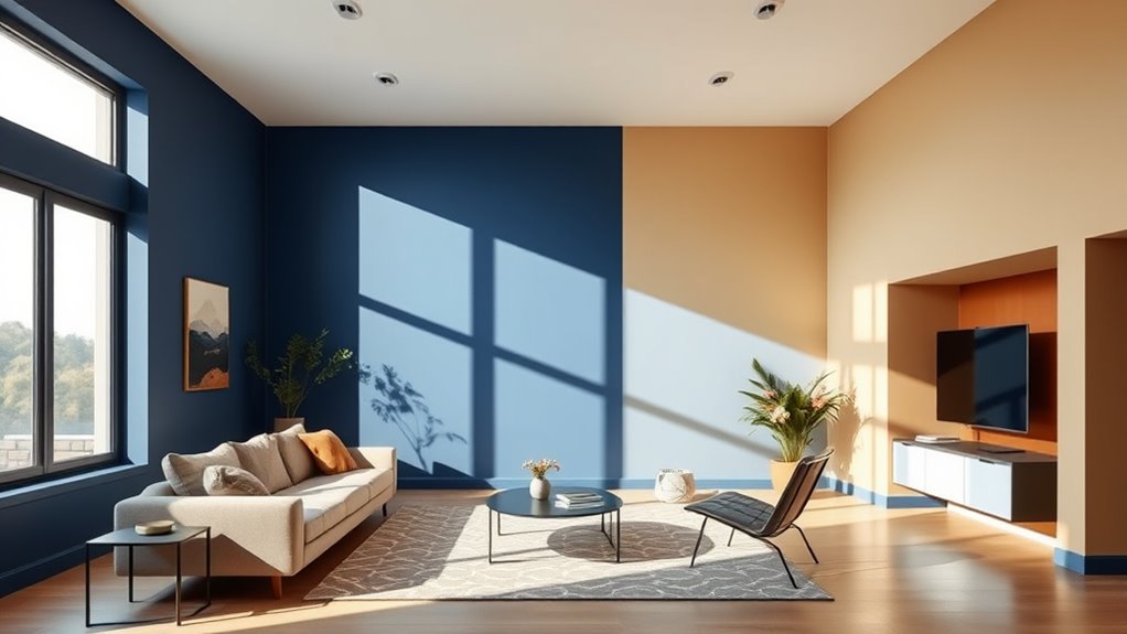

Using a two-tone color scheme is a smart way to define different areas within a space. By choosing contrasting or complementary colors, you can create visual boundaries that highlight function or mood. For example, pairing a warm, bold hue with a softer tone can separate a cozy reading nook from a lively kitchen. Strategic placement of these colors guides the eye and enhances flow. Keep exploring for more tips on how to master this versatile design trick.
Key Takeaways
- Use contrasting colors on walls and furniture to create distinct zones within open-plan spaces.
- Apply bold or darker tones on lower walls or accents to define boundaries and add visual depth.
- Incorporate lighter or contrasting colors on ceilings and upper walls to enhance spatial perception.
- Use two-tone color schemes to highlight architectural features and guide the eye through the room.
- Balance high-contrast combinations with neutral tones to maintain harmony while defining separate areas.

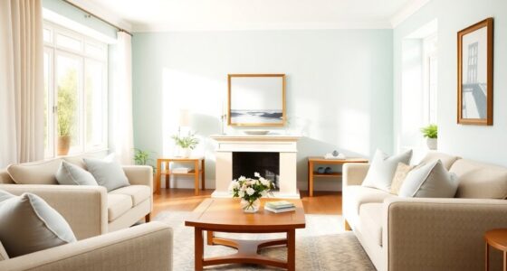
Have you ever wondered how some designs instantly feel harmonious while others clash? It’s all about how you use color. When you’re working with a two-tone scheme, the key lies in understanding palette contrast and how it influences mood creation. These elements can make or break the overall vibe of a space, so it’s worth paying close attention to your choices.
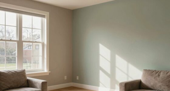
Palette contrast involves selecting two colors that either complement or contrast each other to create visual interest. If you want a space that feels balanced and soothing, you might choose colors close on the color wheel, such as soft blues and gentle greens. This low contrast approach offers a harmonious effect that’s easy on the eyes. Conversely, high contrast palettes—like black and white or vibrant red and cool gray—generate energy and dynamism. They create a striking visual impact that instantly draws attention, making a room feel more alive. Your choice of palette contrast should depend on the mood you want to evoke. For a calm, relaxing environment, opt for subtle contrasts. If you’re aiming for excitement or a modern edge, go for bold, contrasting colors.
Choosing between subtle and bold contrasts shapes your space’s mood and visual impact.
Mood creation is another essential factor when selecting your two-tone scheme. Colors have psychological effects that influence how you feel in a space. Warm tones such as reds, oranges, and yellows tend to energize and stimulate, making a room feel lively and inviting. Cool tones like blues, greens, and purples promote calmness and relaxation, ideal for bedrooms or quiet corners. When you combine two colors, think about how their interaction amplifies or balances the mood. For example, pairing a vibrant yellow with a deep navy creates a playful yet sophisticated atmosphere. Using a muted palette with contrasting tones can evoke understated elegance, while bright, contrasting colors can energize a space instantly. Additionally, understanding color psychology can help you select shades that enhance your desired ambiance.
Another way to enhance mood creation is through the use of accent walls or furniture pieces painted in your chosen contrasting colors. This technique helps define areas within a room, subtly signaling different functions or zones. It’s like creating visual cues that guide how you experience the space. When you’re designing, remember that your color choices can influence how spacious or cozy a room feels. Light, contrasting colors tend to open up a space, making it feel larger and airier. Darker, contrasting tones can make a space feel intimate and cozy.
Ultimately, mastering palette contrast and understanding how it affects mood creation empower you to craft spaces that feel just right. Whether you want a peaceful retreat or an energetic hub, your two-tone approach can set the tone perfectly. It’s about making intentional choices that communicate your style and influence how you and others experience the space. When you get these elements right, your design becomes more than just aesthetic—it transforms the way you live within it.

LM-Kreativ Metallic Wall Paint 67.62 fl oz – Bronze – Stunning Metallic Shine for Stylish Interiors, Easy to Apply, Water-Based, Perfect for Creative Wall Designs & DIY Projects
Luxurious Metallic Finish for Bold Interiors: Add depth, elegance, and shine to your space with this metallic wall…
As an affiliate, we earn on qualifying purchases.
As an affiliate, we earn on qualifying purchases.
Frequently Asked Questions
How Can I Choose Complementary Two-Tone Color Combinations?
When choosing complementary two-tone color combinations, you focus on creating color harmony and accentuating contrast. Pick colors opposite each other on the color wheel, like blue and orange, to achieve striking color contrast. Guarantee the shades balance well so they don’t overpower each other. Test different intensities and tones to find the perfect harmony, making your space feel vibrant yet cohesive. This approach helps define spaces effectively through color.
What Color Schemes Work Best for Small Spaces?
Think of your small space as a canvas waiting for a splash of color. Light, neutral shades like soft grays or pastels create a sense of openness, making the room feel larger. Color psychology guides your choices—cool tones evoke calm, while warm tones add coziness. Aim for visual harmony by balancing bold accents with subtle backgrounds. These strategies help your space feel inviting, spacious, and perfectly tailored to your style.
How Do Lighting Conditions Affect Two-Tone Color Perception?
Lighting conditions greatly influence your two-tone color perception, affecting how you see color contrast and overall space. When lighting is bright, colors appear sharper, enhancing the definition between two tones. In dim lighting, contrast softens, making distinctions less obvious. You should consider the lighting perception in your space to choose colors that maintain their intended impact, ensuring your two-tone scheme effectively defines areas regardless of changing light levels.
Can Two-Tone Schemes Be Used in Outdoor Design?
Ever notice how two-tone schemes can make outdoor spaces pop? You can definitely use them in outdoor design, creatively blending landscape integration and outdoor material choices. By selecting contrasting colors, you define zones and highlight features effortlessly. Just remember, lighting conditions outdoors influence how colors appear, so test your palette in different weather and times of day. This approach adds visual interest and cohesion, transforming your outdoor area into a stunning, functional space.
How Do I Balance Two Contrasting Colors Without Overwhelming the Space?
To balance two contrasting colors without overwhelming your space, focus on achieving visual harmony through color contrast. You can do this by using one color as a dominant hue and the other as an accent. Incorporate neutral tones to soften the contrast, and keep the overall color palette cohesive. This approach helps create a dynamic yet balanced look, ensuring the space feels vibrant without feeling chaotic or overwhelming.
Large Framed Green Abstract Wall Art, 2 Piece Modern Canvas Prints Paintings, Black and Gray Pictures with Gold Accents for Living Room Hallway Dining Room Bedroom Office Wall Decor 24×36 In
[Framed Wall Art]: This set of 2 large abstract wall art features dark green tones layered with black…
As an affiliate, we earn on qualifying purchases.
As an affiliate, we earn on qualifying purchases.
Conclusion
By mastering two-tone color schemes, you can effortlessly define and transform spaces with just a few strategic choices. Remember, “A picture is worth a thousand words,” so use color wisely to communicate your style and vision. Don’t be afraid to experiment; every room has potential waiting to be accessed. With these tricks, you’re well on your way to creating environments that are both beautiful and meaningful. Trust the process, and watch your spaces come alive.

Roundhill Furniture Oriental Shoji 4 Panel Screen Room Divider, Cherry
4-panel room divider screen with fiber glass like heavy duty rice paper;
As an affiliate, we earn on qualifying purchases.
As an affiliate, we earn on qualifying purchases.

FolkArt 34165 Home Decor Chalk Furniture & Craft Paint in Assorted Colors, 8 ounce, Java
VERSATILE SIZE – This unique chalk acrylic paint comes in a convenient 8 oz size and has a…
As an affiliate, we earn on qualifying purchases.
As an affiliate, we earn on qualifying purchases.