
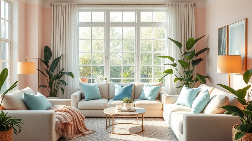
To promote calm and happiness, choose colors like soft blues, gentle greens, and warm beiges, which evoke relaxation and comfort. Bright shades such as yellow and orange can boost energy and optimism when used thoughtfully. Balance vibrant hues with calmer tones to avoid overwhelming your space. Keep cultural meanings in mind to make certain your color choices resonate positively. Explore further to discover how strategic color selection can enhance emotional well-being and effective communication.
Key Takeaways
- Use calming hues like pastel blues, soft greens, and warm beiges to create a relaxing environment.
- Incorporate bright yellow and orange to evoke feelings of happiness and energy without overwhelming the space.
- Balance vibrant colors with muted tones to maintain harmony and prevent visual overstimulation.
- Consider cultural interpretations of colors to ensure they promote positive emotions and avoid miscommunication.
- Apply color strategically to foster emotional resonance, comfort, and a sense of calm and happiness in your design.
Color psychology plays a crucial role in design because the colors you choose can influence emotions, perceptions, and behaviors. When you’re selecting hues to promote calm and happiness, understanding color symbolism becomes essential. Color symbolism refers to the associations and meanings that different colors hold, which can vary across cultures. For example, in Western cultures, blue often symbolizes trust and serenity, making it a popular choice for creating a peaceful atmosphere. Conversely, in some Eastern cultures, blue can symbolize immortality or healing. Recognizing these cultural color meanings helps you select the most effective colors for your intended audience, ensuring your message resonates appropriately.
Choosing calming and cheerful hues is more than just picking pretty shades; it involves considering how different cultures interpret those colors. For instance, green is widely associated with nature and growth in many Western societies, evoking feelings of renewal and tranquility. However, in some Asian cultures, green can carry different connotations, such as jealousy or superstition. Similarly, yellow often symbolizes happiness and optimism in Western contexts, but in some parts of the world, it can represent caution or even treachery. By understanding these cultural color meanings, you can avoid unintended miscommunications and select colors that genuinely foster the emotions you’re aiming for. Additionally, understanding color symbolism can help you design spaces and visuals that are culturally sensitive and emotionally impactful.
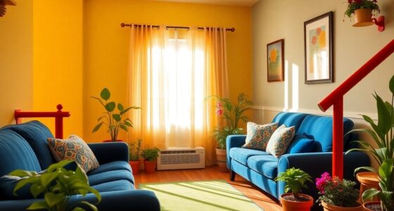
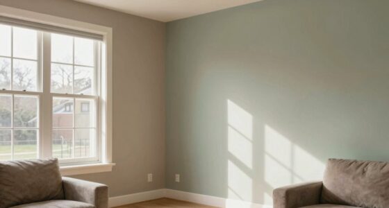
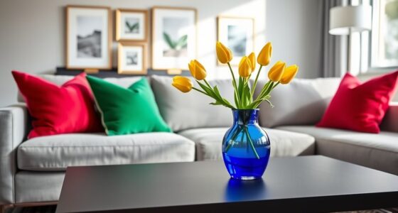
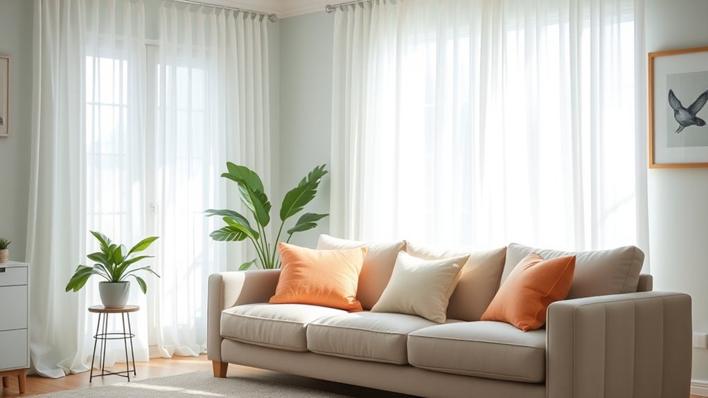
When aiming to create a calming environment, you might gravitate toward softer, muted tones like pastel blues, gentle greens, or warm beiges. These hues are known to evoke feelings of relaxation and stability. Bright, vibrant colors, like sunny yellows or lively oranges, can evoke happiness and energy, but they might be overwhelming if overused. Balance is key. Incorporate these colors thoughtfully, considering their cultural implications, to craft spaces or designs that promote positive emotions. For example, a healthcare setting might benefit from soothing blue and green shades, which help foster trust and comfort, while a cheerful marketing campaign might use sunny yellow or energetic orange to evoke optimism and enthusiasm.

YOA Sheepskin Texture Wall Paint, Art Paint, Sky Blue 32 oz, For Walls and Ceilings – DIY Wall Repair and Decorative, Finish for Living Room Bedroom Hallway
【Easy to Use】Simply open the lid and stir thoroughly before applying Lambskin Wall Paint; no complicated methods needed…
As an affiliate, we earn on qualifying purchases.
As an affiliate, we earn on qualifying purchases.
Frequently Asked Questions
How Does Color Psychology Influence Workplace Productivity and Morale?
Color psychology impacts your workplace productivity and morale by shaping how you feel and behave. You’re influenced by color associations and symbolism; for example, blue can boost focus, while green promotes balance and calm. When you choose colors thoughtfully, you create an environment that fosters motivation and positivity. This strategic use of color can improve teamwork, reduce stress, and increase overall efficiency, making your workspace more inspiring and productive.
Can Specific Colors Trigger Emotional Responses Differently Across Cultures?
Yes, specific colors can trigger emotional responses differently across cultures due to cultural color meanings and cross-cultural color perception. For example, white symbolizes purity in Western cultures but can represent mourning in some Asian countries. You should consider these differences when choosing colors, especially for international settings, to guarantee your message resonates positively. Understanding cultural color meanings helps you create environments that evoke the intended emotions and foster connection.
Are There Any Colors to Avoid in Spaces Meant for Relaxation?
In relaxing environments, you should avoid bold, overly stimulating colors like bright reds or neon shades, as they can increase energy and hinder relaxation. Color avoidance of such hues helps create a calm atmosphere. Instead, opt for softer, muted tones that promote tranquility. Staying mindful of color choices guarantees your space remains soothing and conducive to relaxation, helping you unwind and reduce stress effectively.
How Do Lighting and Color Interact to Affect Mood?
Did you know that lighting intensity and color temperature directly influence your mood? You’ll feel calmer in a space with soft lighting and warm color temperatures, which enhance relaxation. Bright, cool lighting can energize you but may cause stress. When you combine the right lighting intensity with hues that promote calm and happiness, you create an environment that boosts your overall well-being and comfort.
Can Individual Preferences Override General Color Psychology Principles?
Yes, your personal preferences can override general color psychology principles. While certain colors are known to promote calm or happiness, your individual taste, experiences, and cultural background influence how you perceive these hues. Cultural differences can also impact color associations, making some colors more meaningful or comforting than others. Trust your feelings and preferences when choosing colors, as they ultimately create a space that feels most positive and authentic to you.

Macrame Moon Dream Catcher for Girl, Green Boho Crescent Dreamcatcher for Bedroom Adult, Handmade Nursery Room Wall Hanging with Star Pendant for Teen, Bohemian Home Decoration Idea
HANDMADE DECORATION: Made from the finest cotton fibers, this dream catcher boasts a delicate and intricate pattern that…
As an affiliate, we earn on qualifying purchases.
As an affiliate, we earn on qualifying purchases.
Conclusion
By understanding color psychology, you can intentionally select hues that foster calm and happiness in your environment. Did you know that 85% of consumers say color influences their purchasing decisions? This highlights how powerful color choices are in shaping feelings and behaviors. So, next time you’re designing a space or choosing an outfit, remember that the right colors can boost mood and create a welcoming atmosphere. Trust your instincts and let color work its magic!

Ophanie Beige Rugs for Living Room Bedroom, 5×8 Fluffy Fuzzy Furry Carpet, Plush Soft Shaggy Bedside Indoor Floor Area Rug for Kids Girls Boys Baby Teen Dorm Nursery Home Decor Aesthetic
Ultra Soft & Non-slip: Featuring a shaggy carpet surface, the Ophanie soft area rug is highly soft with…
As an affiliate, we earn on qualifying purchases.
As an affiliate, we earn on qualifying purchases.

BBiggood Yellow Throw Pillow Covers, Super Soft Faux Fur Pillow Cases Set of 2, 18 x 18, Room Decor
Material:Polyester. Tips:because this product is made of fluff, please be careful not to clip fluff when using the…
As an affiliate, we earn on qualifying purchases.
As an affiliate, we earn on qualifying purchases.