

High-contrast design improves visibility and readability for aging eyes, which often experience reduced contrast sensitivity. By choosing colors with strong visual differences, like dark navy paired with light yellow, you make content easier to see and navigate. Following accessibility standards, such as WCAG contrast ratios, ensures your designs are inclusive and user-friendly. To create effective high-contrast visuals that work across devices and environments, keep learning how to enhance contrast for all users.
Key Takeaways
- High-contrast color schemes improve readability and reduce visual strain for aging eyes.
- Adhering to accessibility contrast ratios ensures content remains legible across devices and lighting conditions.
- Using bright, distinct hues for interactive elements enhances visibility and user engagement.
- Testing contrast effectiveness on various screens helps maintain visibility in different environments.
- Inclusive design practices promote accessible, user-friendly digital experiences for users with visual impairments.

Have you ever struggled to read text or distinguish elements on a digital screen? If so, you’re not alone. As we age, our eyes become more sensitive to contrast, making it harder to see certain colors or read small fonts. That’s where high-contrast design comes into play. By intentionally choosing color combinations that create strong visual distinctions, you can markedly improve readability and usability, especially for those with aging eyes. When designing with high contrast in mind, it’s essential to think about accessibility standards, which provide guidelines to ensure your content is usable by everyone, including people with visual impairments. These standards recommend specific contrast ratios between text and background to guarantee sufficient visibility. For example, black text on a white background typically exceeds these standards, making it easier to read for most users. Conversely, combinations like light gray on white can hinder readability and should be avoided.
Incorporating high-contrast color combinations isn’t just about aesthetics; it directly impacts accessibility and user experience. Think about how you choose colors for headings, buttons, and links. Bright, distinct hues paired with neutral backgrounds can help users easily identify interactive elements. When selecting these color combinations, always check them against established accessibility standards, such as the Web Content Accessibility Guidelines (WCAG). These standards specify minimum contrast ratios—generally 4.5:1 for normal text and 3:1 for large text—to ensure your content is legible for users with visual challenges. By adhering to these guidelines, you create a more inclusive environment that respects diverse visual needs.
You might also consider how your color choices affect overall visual harmony. High-contrast does not mean jarring or clashing colors; it’s about balance. For instance, pairing a dark navy with a light yellow offers excellent contrast without overwhelming the viewer. Such thoughtful combinations can improve clarity and reduce eye strain, especially for older users who may find low-contrast designs difficult to interpret. Additionally, test your designs across different devices and lighting conditions. What looks good on your monitor may not perform well on a smartphone or in bright sunlight. Make adjustments as needed to maintain the integrity of your high-contrast color schemes.
Finally, understanding the importance of Hackathons and engaging in events like Hack’;n Jill can provide opportunities to learn and implement inclusive design principles through collaborative projects. Ultimately, implementing effective high-contrast design requires a mindful approach to color combinations aligned with accessibility standards. By doing so, you not only enhance visibility but also demonstrate a commitment to inclusive digital experiences. Whether designing a website, app, or digital signage, prioritizing contrast ensures that your content remains accessible, legible, and user-friendly for everyone—regardless of age or visual ability.

acer KB242Y – 23.8 Inch IPS Zero-Frame Full HD (1920 x 1080) Monitor | Tilt | Up to 120Hz Refresh | 1ms (VRB) | sRGB 99% | HDMI & VGA Ports | Adaptive-Sync Support (FreeSync Compatible)
Incredible Images: The Acer KB242Y G0bi 23.8" monitor with 1920 x 1080 Full HD resolution in a 16:9…
As an affiliate, we earn on qualifying purchases.
As an affiliate, we earn on qualifying purchases.
Frequently Asked Questions
How Does High-Contrast Design Impact Users With Color Blindness?
High-contrast design improves accessibility for users with color blindness by enhancing color perception and making content easier to distinguish. It helps you quickly identify important elements without relying solely on color cues, reducing confusion. By incorporating design adaptation like bold contrasts and clear distinctions, you guarantee that everyone, regardless of visual limitations, can navigate and understand your interface effectively. This approach creates a more inclusive experience for all users.
Are There Specific Colors Recommended for High-Contrast Interfaces?
Think of your interface as a vibrant painting—choose color pairings that pop without clashing. For high-contrast design, opt for bold, saturated colors like black and white, or deep blues with light yellows. Adjust brightness levels to create a clear separation between elements, making text and buttons stand out like stars in a night sky. This guarantees your visual message shines brightly for everyone, especially those with aging eyes.
Can High-Contrast Design Improve Accessibility for All Users?
Yes, high-contrast design can improve accessibility for all users by reducing visual fatigue and making content clearer. It helps those with visual impairments and benefits everyone by enhancing readability. While focusing on functionality, you should also consider aesthetic aspects to maintain an appealing interface. Balancing contrast with design elements guarantees that users experience both accessibility and visual comfort without compromising the overall aesthetic.
How Does High-Contrast Design Affect User Experience Beyond Visibility?
You’ll find that high-contrast design boosts emotional engagement by making content more inviting and easier to process. Studies show it reduces cognitive load, allowing you to focus without frustration. When visuals are clear and striking, you stay more engaged, feel less overwhelmed, and enjoy a smoother experience. This approach not only improves accessibility but also fosters a positive connection with users, encouraging continued interaction and satisfaction.
What Are Common Mistakes to Avoid in High-Contrast Design?
You should avoid color clashes and overexposure in high-contrast design. Using clashing colors can create visual discomfort and reduce readability, while overexposure with overly bright whites or stark contrasts can strain aging eyes. Make certain you balance contrast levels carefully, test your designs for visual harmony, and use subtle transitions to prevent eye fatigue. These mistakes hinder accessibility and user comfort, so prioritize well-considered contrast choices.
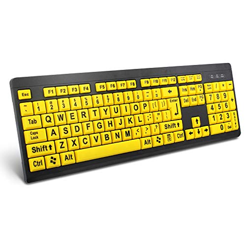
BOOGIIO Large Print Computer Keyboard, Wired USB High Contrast Keyboard with Oversized Print Letters for Visually Impaired Low Vision Individuals (Yellow+Black)
⌨【Large Print Keyboard】With letter characters larger than usual and command keys in a larger bolder font, these high-contrast…
As an affiliate, we earn on qualifying purchases.
As an affiliate, we earn on qualifying purchases.
Conclusion
By embracing high-contrast design, you turn everyday visuals into a lighthouse guiding aging eyes safely through information. It’s not just about readability; it’s about empowering confidence and independence. Think of high contrast as your visual armor—protecting and enhancing your experience. Don’t let low contrast be the fog that clouds clarity. Instead, let bold contrasts illuminate your path, making every detail sharp and accessible. Because when visibility improves, your world becomes brighter and more vibrant.

Veidoo 5.8 inch Ebook Reader, HD Touch Screen Carta E-Ink Technology, 32GB ROM(TF Card Expansion to 64G), WiFi, Long Endurance, Android E-Reader(White)
【Eye friendly】6-inch touch screen with E-Ink technology, you can enjoy an eye-friendly and comfortable reading experience anywhere at…
As an affiliate, we earn on qualifying purchases.
As an affiliate, we earn on qualifying purchases.
![WavePad Audio Editing Software - Professional Audio and Music Editor for Anyone [Download]](https://m.media-amazon.com/images/I/B1fcLEGCs6S._SL500_.png)
WavePad Audio Editing Software – Professional Audio and Music Editor for Anyone [Download]
Full-featured professional audio and music editor that lets you record and edit music, voice and other audio recordings
As an affiliate, we earn on qualifying purchases.
As an affiliate, we earn on qualifying purchases.